
CASE STUDY / LOGO DESIGN
Building a Brand From a One-Word Brief
PALOMINO JEWELRY • BRAND IDENTITY • PRINT + DIGITAL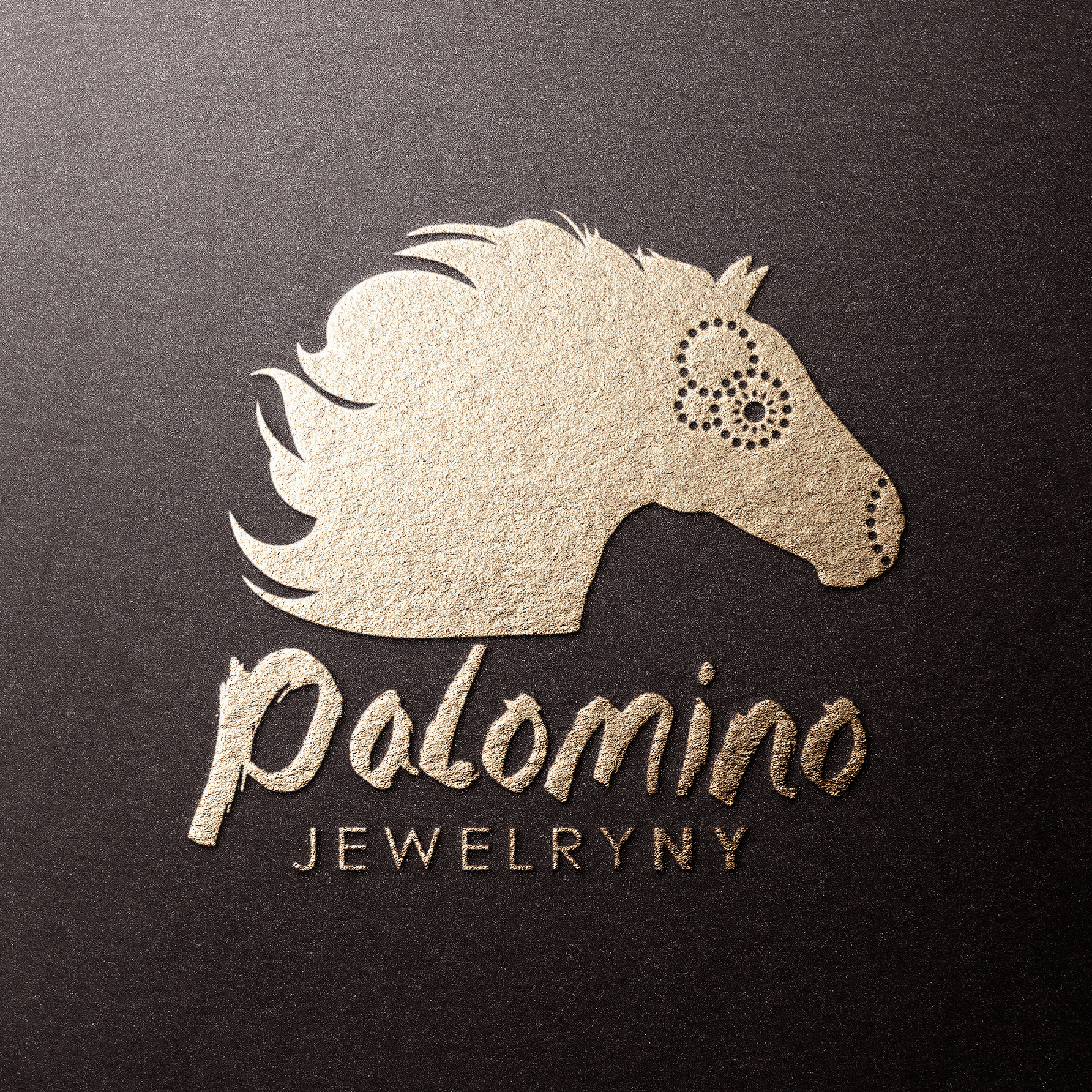
The logo. A horse in motion, softened from the original logo's harshness, with dot-built details echoing the jewelry itself.
THE PROBLEM
The founder of Palomino Jewelry makes intricate, bold, nature-inspired pieces by hand. Her direction for the logo was a single idea: capture the spirit of a horse. Nothing more, and that is common and understandable. A client's expertise is her craft, and ours is turning a vague spark into a visual identity that will work for years. The existing logo also read harsh, a horse with no warmth in it.
THE APPROACH
We drew a softer horse in motion, conveying beauty rather than force, with feathery, Southwestern-inflected imagery tying into the natural materials her jewelry uses. The horse's eye and nose are built from circles of dots, a detail borrowed straight from the intricacy of her pieces. For the typography we chose a paint-style font, a nod to the hand painting in her work. The logo is rendered in all black, reflecting the boldness of the jewelry and our standard practice of designing in one or two colors so it adapts affordably everywhere it needs to live.
THE OUTCOME
A logo that captures the brand in one gesture: beauty, motion, artistry, and boldness. It works as hard online as it does in print, carrying across her website, email signature, and social media through to business cards, packaging, stickers, and flyers, holding up in a single color everywhere it lands. The founder returned to LOMAXcreative to brand her next venture.
1 Word
‘HORSE’ WAS THE ENTIRE CREATIVE BRIEF
1 Color
ALL BLACK, FOR BOLDNESS AND AFFORDABLE ADAPTABILITY
Dots
EYE AND NOSE BUILT FROM CIRCLES, A DETAIL FROM THE JEWELRY'S INTRICACY
Paint Font
TYPOGRAPHY NODDING TO THE HAND PAINTING IN HER PIECES
Scope also included: concept development and creative direction from a one-word brief, a business card, two brand patterns, and social media icons.
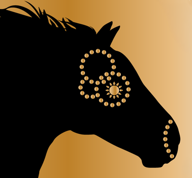
The details. Up close, the eye and nose resolve into circles of dots and the mane into feathery, Southwestern-inflected strokes, the intricacy of her jewelry carried straight into the logo.
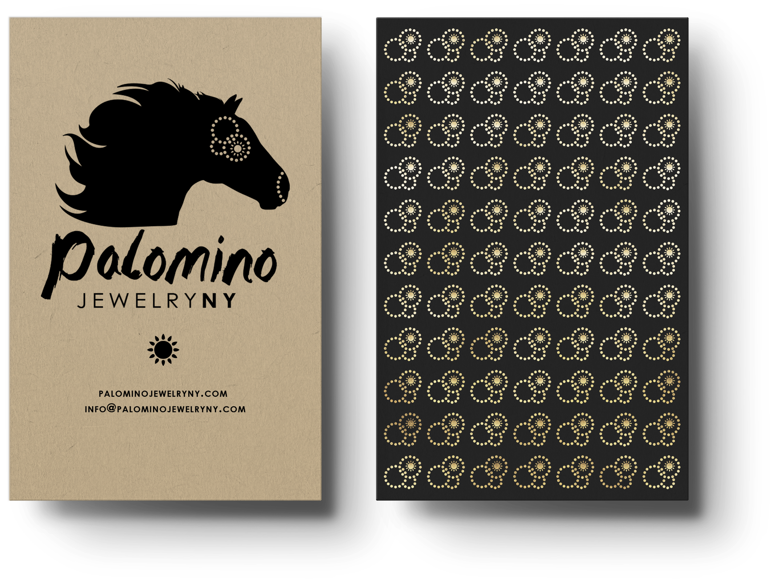
The business card. Printed uncoated on natural, craft-style stock so it reads as tactile in the hand. The back carries a pattern drawn from the dotwork around the horse's eye, turned to a new angle, showing versatility.
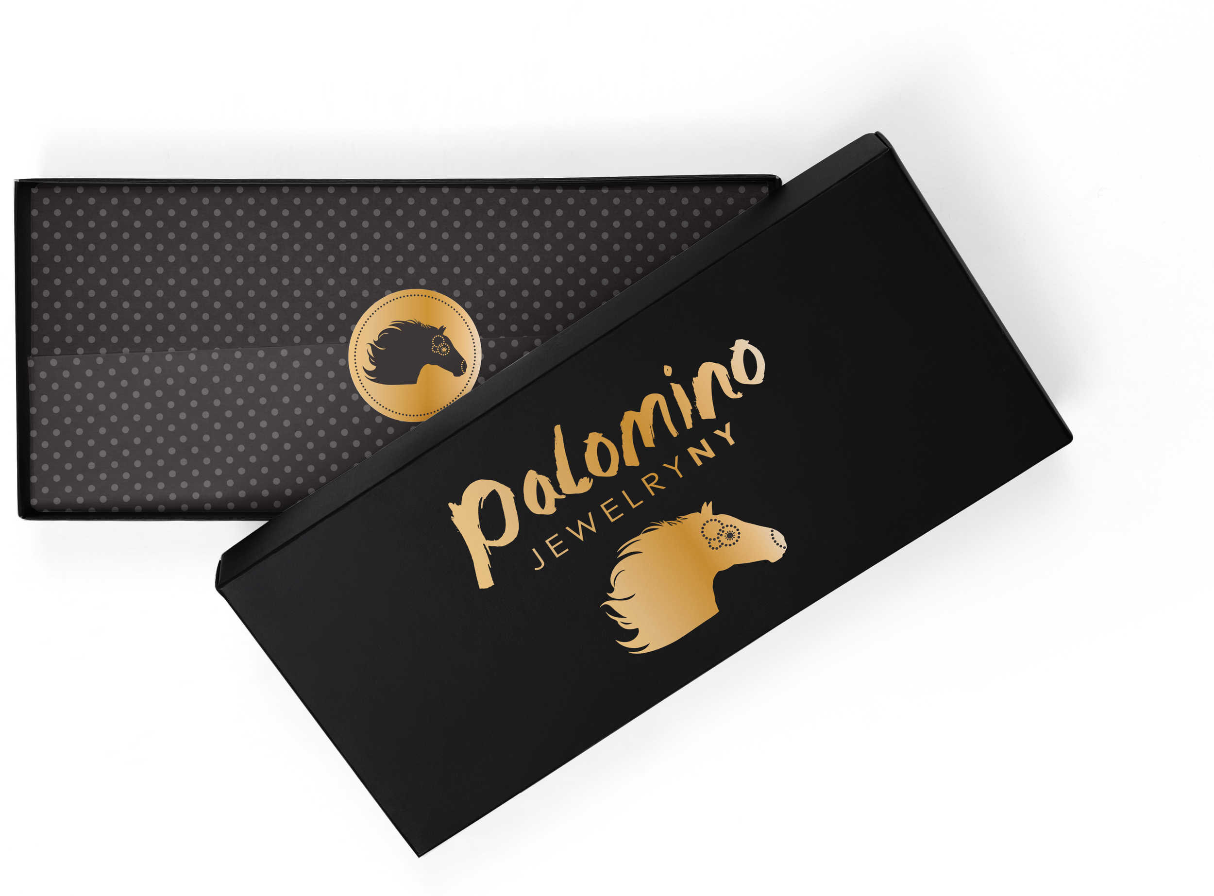
In the wild. The logo carries across packaging, stickers, foil-stamped pieces, and social media icons, reading cleanly at every size.
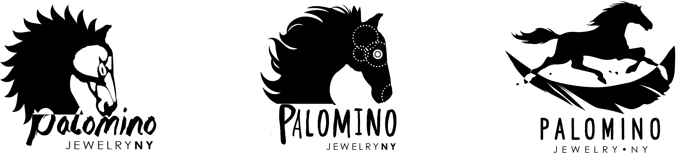
The options. Every logo project ships with two to three developed directions, not sketches, so the client chooses from finished designs.
Process note: A one-word brief is not a thin brief, it is a trusting one. Our job is to study what the client actually makes, her materials, her intricacy, her boldness, and hand back a logo she recognizes as hers on first sight.
How We Work With Founders and Boards
Logo projects usually start with very little: a mission, a name, sometimes a single word of direction. That is not a problem, it is the job. We turn that starting point into developed concepts, not sketches, and we design for the realities nonprofits and small businesses live with: one- and two-color versions that keep printing affordable, black-and-white secondaries for single-color use, and a full family of files ready for everything from letterhead to lapel pins. Twenty years in the print industry means the logo will reproduce beautifully everywhere it lands.
“I was so thrilled with the outcome and process of recreating my company’s brand and logo! When I went to LOMAXcreative / Karen I knew that my logo did not represent me but I could not articulate how I wanted it changed or what I wanted it to be, other than an image of a horse. I could tell from how Karen was asking questions during our initial conversations that I had made the right choice. I could not be more happy with the logo and branding, it exceeded my expectations, and was such an easy and streamlined process. I could not recommend Karen / LOMAXcreative more highly…in fact I hired her again to brand my next adventure with Race and Revolution!”
Building a brand?
Thirty minutes, no obligations. We'll talk about your mission, your audience, and what a logo has to do for you.