
CASE STUDY / LOGO + BRANDING DESIGN
Turning Five Initials Into a Movement
MARIA TORRES EMERGING ARTISTS FOUNDATION • LOGO + BRAND IDENTITY • PRINT + DIGITAL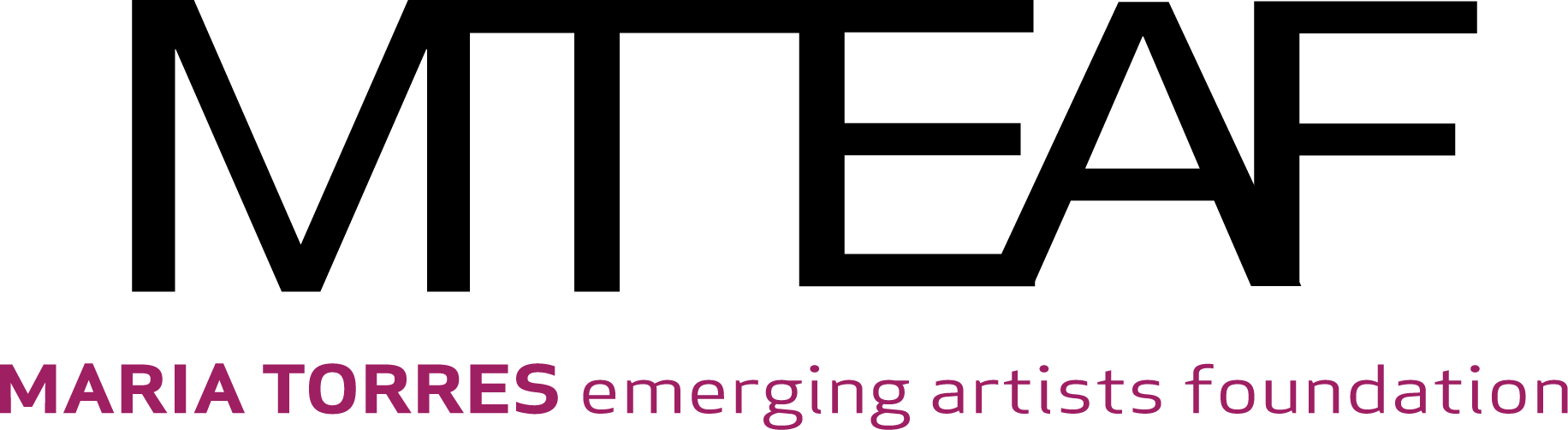
The primary logo. Five interconnected initials, with the T's extended top breaking the rules just enough to say arts organization.
THE PROBLEM
Maria Torres, the renowned performer, director, and choreographer, was launching the Maria Torres Emerging Artists Foundation, a new arts nonprofit in New York City, with actress and singer Vanessa Williams as co-founder. A high-profile launch in the city's arts scene, a donor audience to impress, and no existing visual identity: the logo had to stand out and stand up everywhere from a website header to a lapel pin.
THE APPROACH
We embraced minimalism and built the logo from the initials themselves, interconnecting the letters of MTEAF to symbolize movement, unity, and the limitless potential of the arts. The extended top of the T breaks traditional letterform rules on purpose, a small act of artistic spirit in a disciplined mark. The palette is black and magenta pink, a vibrant contrast in just two colors so reproduction stays affordable across pins, pens, hats, and shirts. We also developed the initials into a repeating pattern at varied sizes and transparencies for social, web, and print applications, and delivered one-color and reversed versions for a complete family.
THE OUTCOME
The identity was met with enthusiasm, and the logo work earned a second commission: designing all event collateral for the MTEAF launch in Harlem. More than a decade later, the foundation is still an active 501(c)(3) arts nonprofit, still pursuing the mission it launched with. A two-color mark built to last and to scale, doing exactly that.
2 Colors
BLACK AND MAGENTA, CHOSEN FOR IMPACT AND AFFORDABLE REPRODUCTION
Encore
THE LOGO WORK LED TO DESIGNING THE FULL LAUNCH EVENT COLLATERAL
Full Family
ONE-COLOR AND REVERSED VERSIONS FOR EVERY MEDIUM
More Than a Decade
THE LAUNCH IDENTITY STILL CARRIES AN ACTIVE ARTS NONPROFIT
Scope also included: logo family, pattern system for social and web, concept development, creative direction, print production.
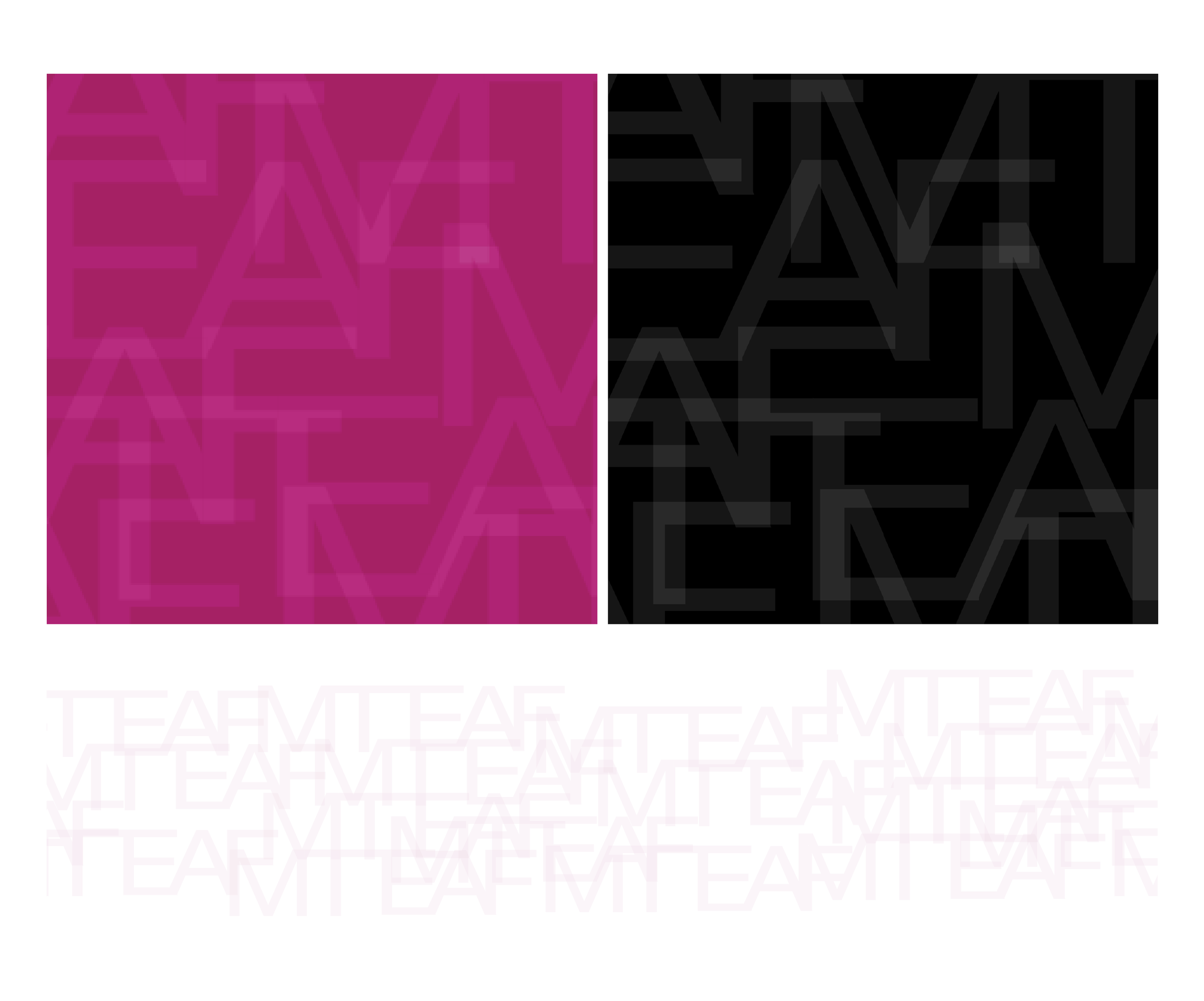
The pattern system. The initials repeated at varied sizes and transparencies: a brand texture for social headers, wallpapers, and print.
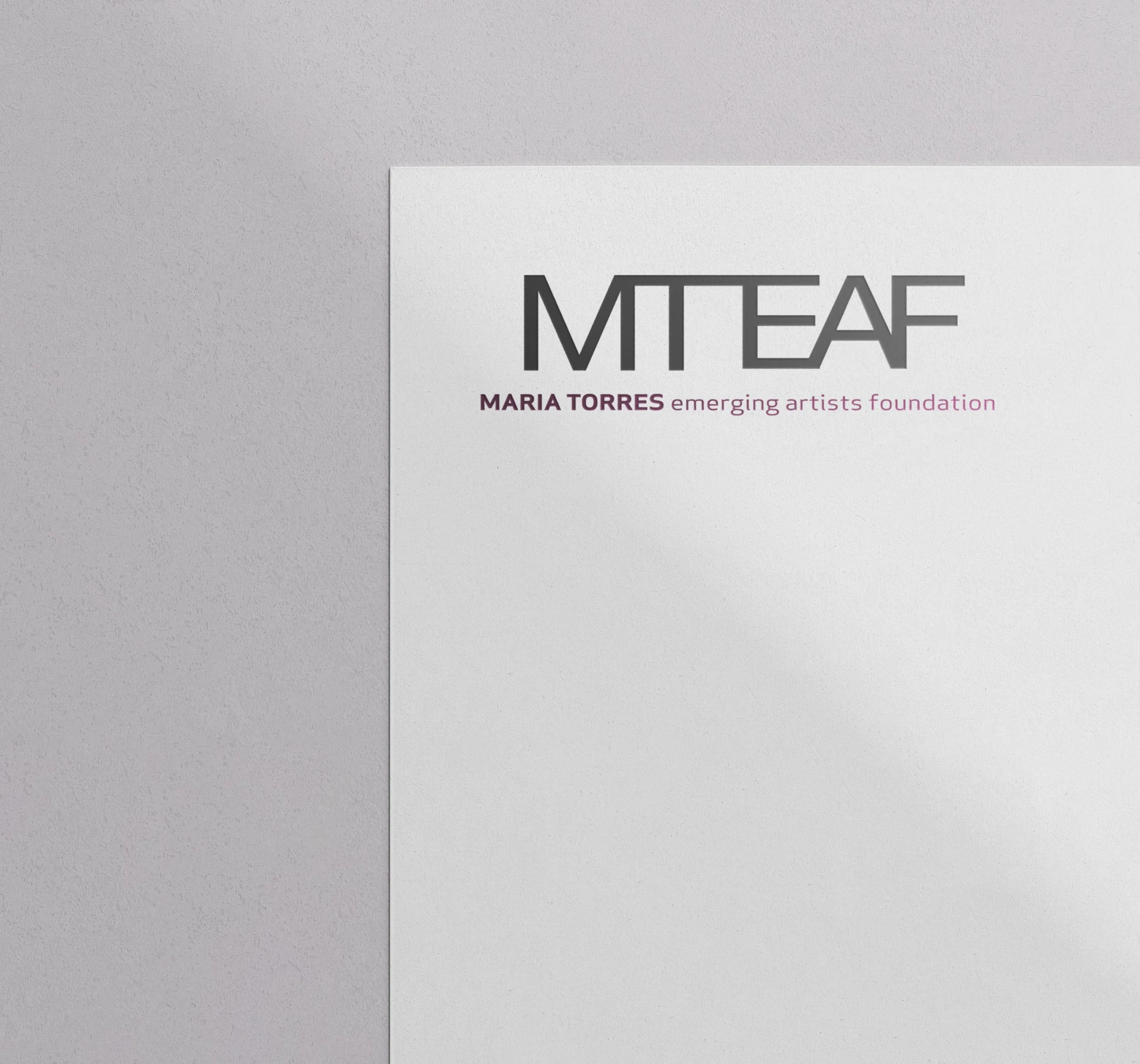
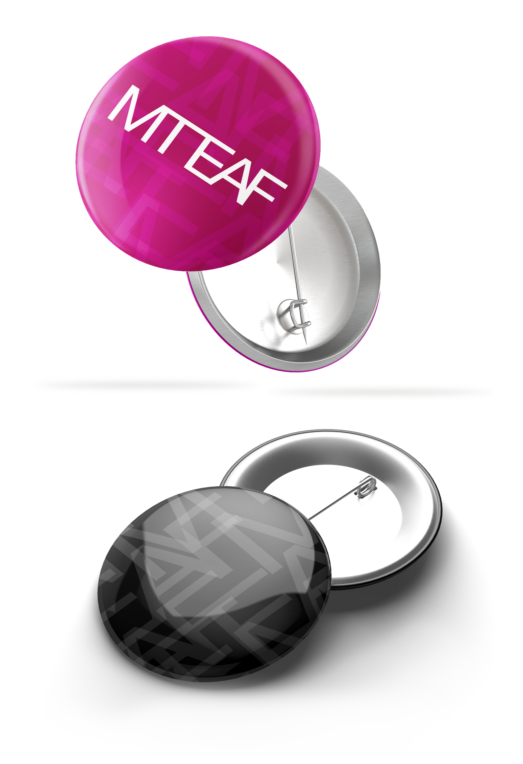
On merchandise. Two colors doing full-brand work across pins and collateral, exactly as designed.
The full family. One-color and reversed versions so the mark holds up in any medium.
Process note: Donor-facing nonprofits need identities that look expensive and print economically. Holding the logo to two colors was a strategic decision made on day one, and it is why the same logo works on a gala invitation and a giveaway pen without a redesign or a surcharge.
How We Work With Founders and Boards
Logo projects usually start with very little: a mission, a name, sometimes a single word of direction. That is not a problem, it is the job. We turn that starting point into developed concepts, not sketches, and we design for the realities nonprofits and small businesses live with: one- and two-color versions that keep printing affordable, black-and-white secondaries for single-color use, and a full family of files ready for everything from letterhead to lapel pins. Twenty years in the print industry means the logo will reproduce beautifully everywhere it lands.

“Karen Lomax is an excellent and thoughtful designer. She heeds and works to create a design that represents the heart of our mission and company.”
Building a brand?
Thirty minutes, no obligations. We'll talk about your mission, your audience, and what a logo has to do for you.