

CASE STUDY / BOOK PRODUCTION + PHOTO EDITING
Built to Last: Print Production for a Sold-Out Jon Bellion Collectible
MENDY BOOKS • JON BELLION: FATHER FIGURE • PRINT PRODUCTION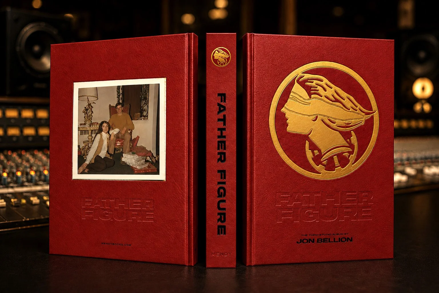
The finished art object. Red leather, a three-layer gold foil emblem over blind and black emboss, black foil, gold foil, and blind emboss dies all on the spine; a tipped-in family photograph sits in its own custom die-cut to the exact size of the print so the edges sit flush; and gilded edges. Rebuilt from a not-yet-press-ready layout into a collectible people paid to own.
THE PROBLEM
Mendy Books set out to turn Jon Bellion's Father Figure album into a collectible artifact: a 240-page luxury hardcover documenting the music, the photography, the lyrics, and Jon's own writing. The book had been designed in Canva, but the file was nowhere near ready for press. It was built in RGB, sized off from the final trim, laid out as single pages instead of true reader spreads, and filled with low-resolution images, with none of the bleeds, dies, varnishes, or color setup a real print run demands. Getting it onto an overseas press meant rebuilding it from the ground up, with the print knowledge the team didn't have in house. And it had to happen fast.
THE APPROACH
I rebuilt the entire book from a blank InDesign file, replicating all 240 pages as press-ready spreads at the correct trim, with every paragraph and object style reconstructed from the original layout. Because the book used metallic ink and spot varnish, I built the file in layers, keeping a separate varnish layer in exact registration above the four-color process and metallic ink layer. Every image in the book carried spot varnish, every photograph, logo, and merch illustration. I reworked each one by hand in Illustrator, building it into a solid varnish shape held in exact registration. I processed the full image program of 174 photographs and illustrations: converting everything from RGB to CMYK, upscaling the files that needed it, color-correcting and retouching throughout, cloning skies to hide rigging wires, and rebuilding several illustrations as vector art in Illustrator. From a single flat cover image, I produced the dies for the whole cover: a three-layer gold foil die for the emblem, built with rivers and valleys so it reads as tactile, with the bandana raised for depth, plus the blind emboss, the black emboss of the title, and the black foil spine, all mapped to the printer's mechanicals. I also introduced the gilded edges that give the Legacy Edition its collector feel, and helped develop its archival storage box. With the press in China and the team split across two coasts, I exported and delivered every file to the printer's exact specifications.
THE OUTCOME
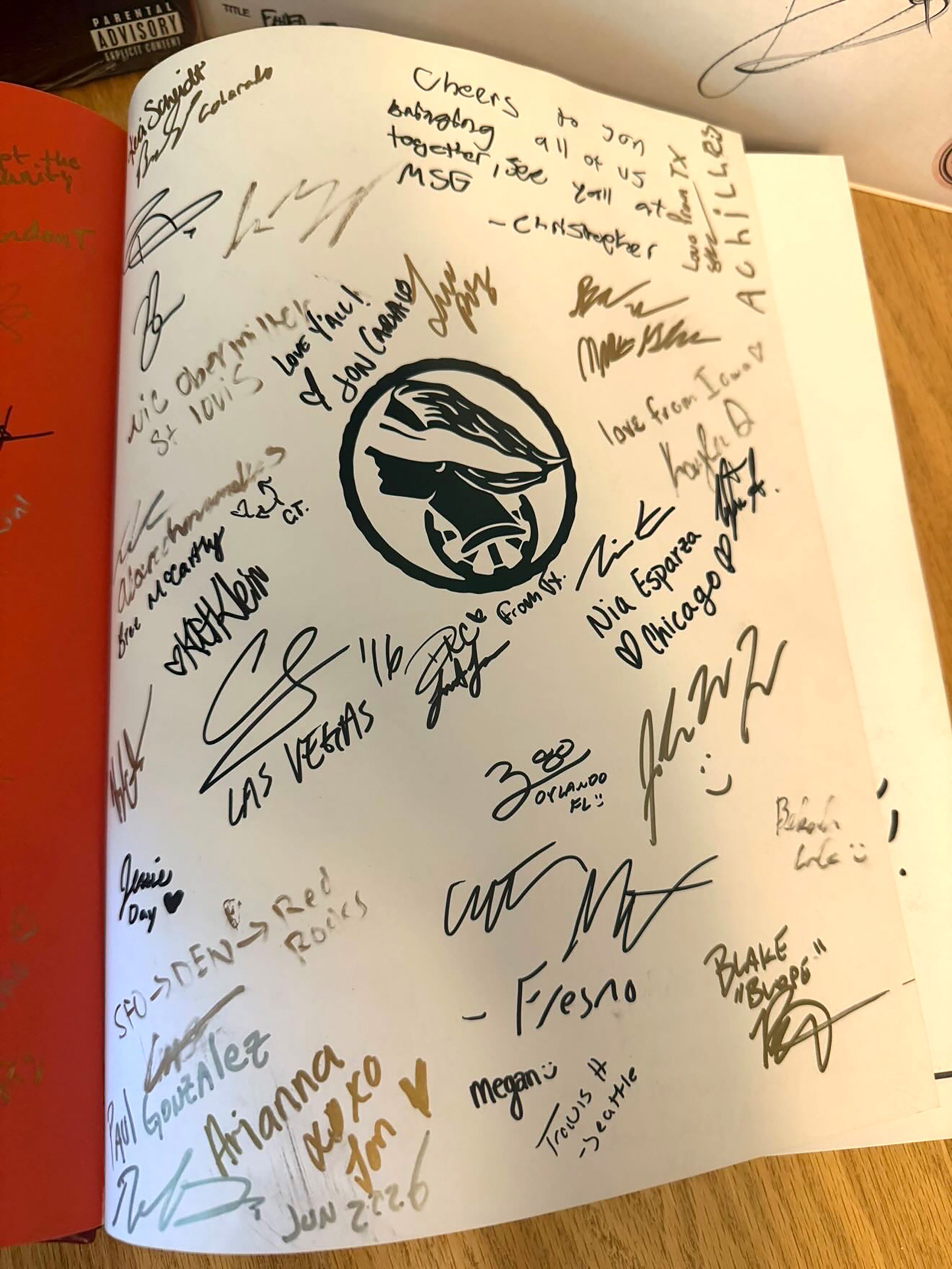
The launch exceeded everyone's expectations. The presale sold roughly 1,500 books, and the 500-copy Legacy Edition, at $395 a copy, nearly sold out immediately. The book landed with people: fans carried a copy from show to show and signed it like a yearbook, an art director filmed a walkthrough praising its detail and the case it makes for printed books, and the launch video passed 12,000 likes within days. Jon was thrilled with it. For a milestone release, the book did the rarest thing a printed object can do now: it made people want something physical to hold onto.
~1,500
BOOKS SOLD IN THE PRESALE, FIRST AND LEGACY EDITIONS COMBINED
500 At $395
HAND-NUMBERED LEGACY EDITIONS, SIGNED BY JON BELLION, NEARLY SOLD OUT
240 Pages / 174 Images
REBUILT FROM A CANVA LAYOUT INTO A PRESS-READY INDESIGN FILE
5 Weeks
FIRST FILES TO PRESS, WITH FOIL, EMBOSS, VARNISH, AND GILT EDGES
Scope also included: three-layer foil cover die, blind and black embossing, black foil spine, gilded edges, a multi-layer varnish setup with spot varnish on every image, full photo editing and retouching of 174 images, vector rebuilds of illustrations and merch, archival box design, and print production management with an overseas press.
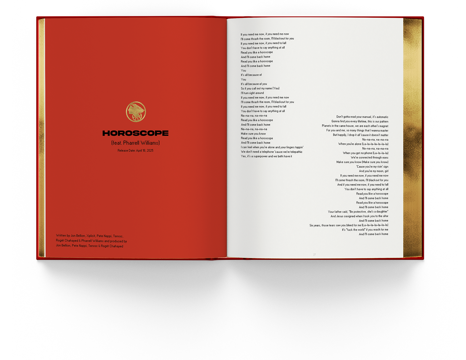
The lyric spreads. Jon's signature red facing black text, with the small gold emblem carrying its own hand-built spot varnish. Every image and logo in the book got the same treatment, masked and registered one at a time.
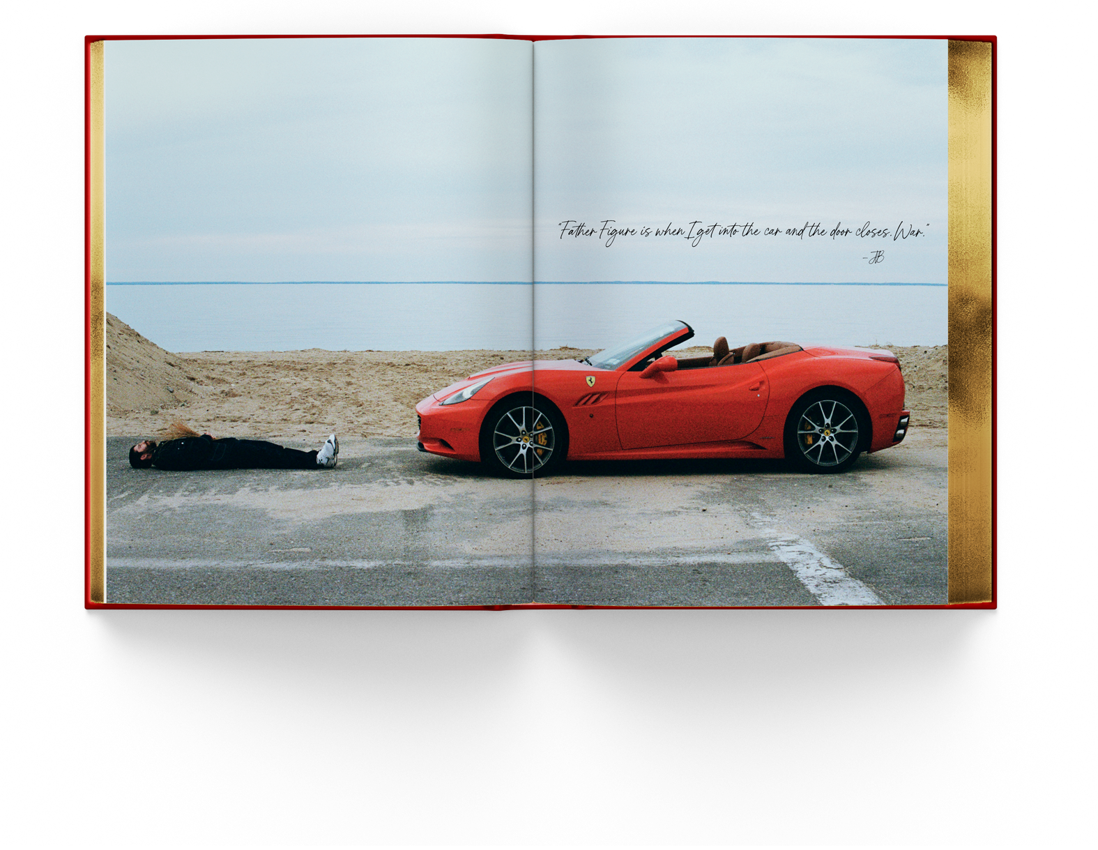
A full-bleed spread across the gutter. Making an image read as one picture across two pages meant rebuilding the layout as true reader spreads from the ground up.
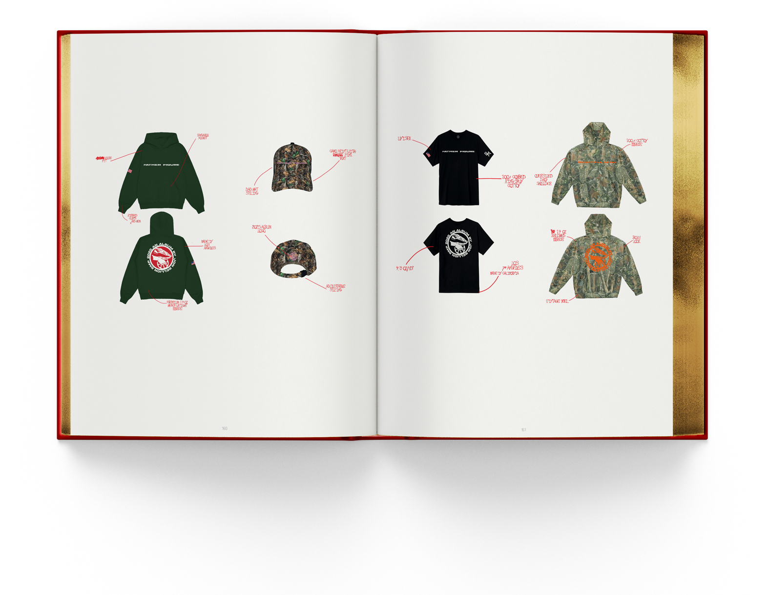
The apparel pages. Every callout and logo rebuilt as vector art in Illustrator, each carrying its own solid spot varnish.
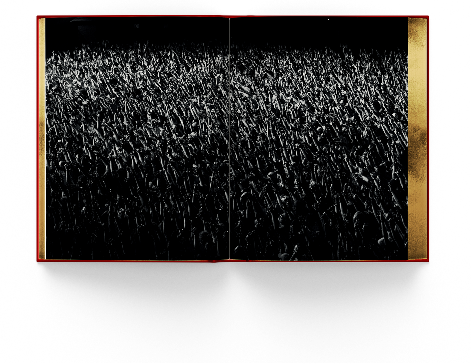
The black-and-white photography. On a phone screen this image would be flat and forgettable. Printed large, on this stock, with real depth, it stops you. That difference is the whole case for print.
Process note: The cover die was the production challenge. Mendy handed me a single flat image of the emblem, which had to feel three-dimensional in the hand and couldn't be stamped from a flat file. I built the gold emblem as a three-layer foil die with rivers and valleys, so the bandana and the face each carry their own depth and read as distinct, then produced the stamps for the blind emboss, the black-emboss title, and the black-foil-emboss spine. Every element across the spine, back, and front cover needed its own individual stamp, each mapped to the printer's mechanicals so every stamp landed exactly where it should. On a press on the other side of the world, that mapping is the difference between a luxury object and an expensive mistake.
Signed like a yearbook. Fans passed a copy from city to city and signed it, which tells you what the object came to mean

“Thank you again for all of your contributions throughout the process. The project truly wouldn’t be what it is without your work and attention to detail.
Thank you again for all of the incredible work!”
How We Work With Authors and Publishers
We come in wherever you are. Some clients hand us a finished manuscript: Word files, statistics, photo folders, and a brand guide. Others hand us a vision and a rough file that isn't built for print yet. Either way, we build the design and production system around your content, turn your material into publication-quality work in your brand, and manage edits through clearly versioned rounds so nothing gets lost between drafts. Twenty years in the print industry and thousands of pieces sent to press stand behind every job. We speak your printer's language, spec the job so it prints the way it was designed, and manage estimates, proofs, and press checks through delivery, holding costs on budgets large and small. Fixed launch dates are treated as fixed.
Have a book or a publication that has to be right in print?
Thirty minutes, no obligations. We'll talk about your project, the finishes it deserves, and what it takes to make an object people keep.