
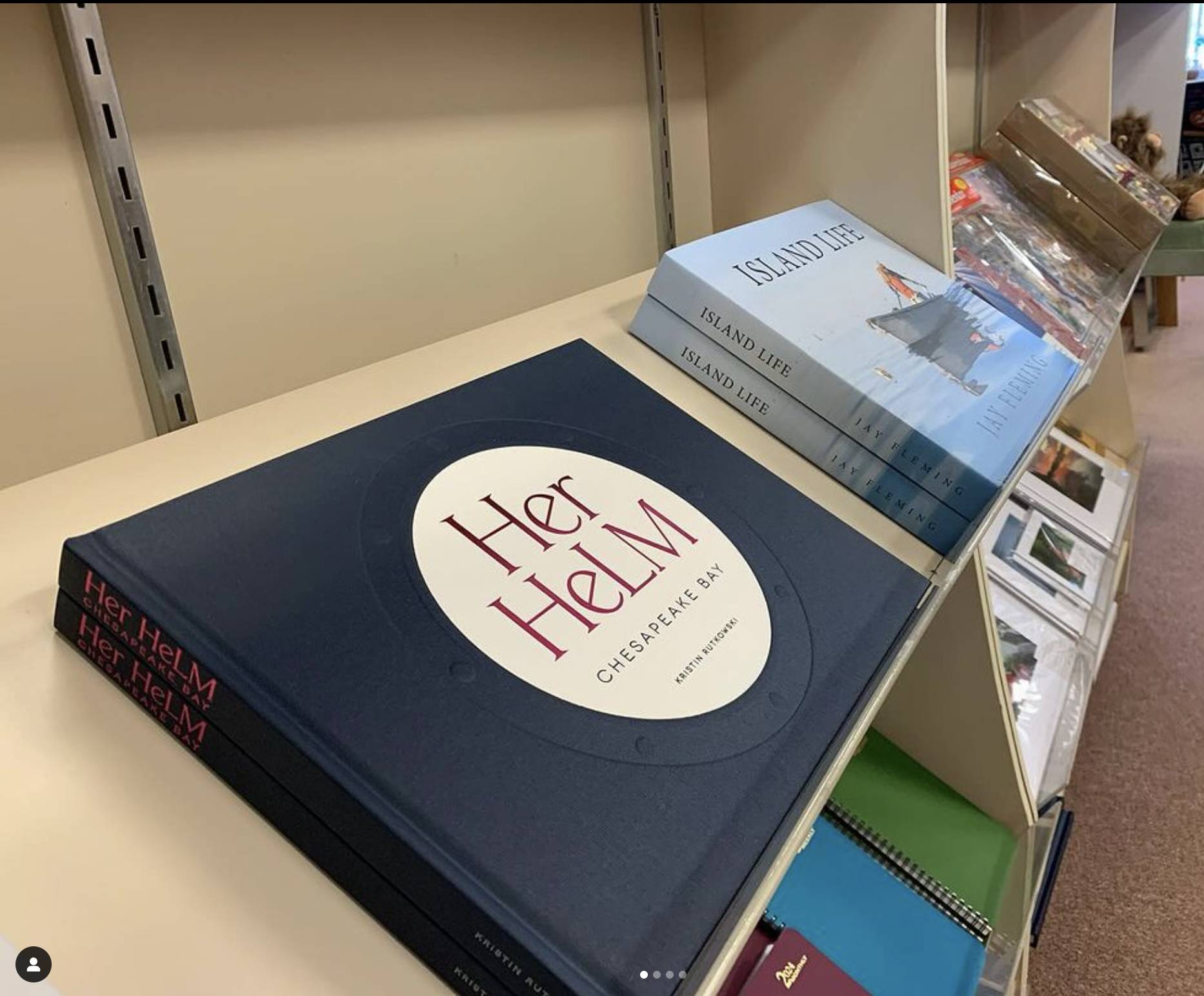
CASE STUDY / BOOK DESIGN
A Luxury Book Delivered in Time for the Gallery Opening
KRISTIN RUTKOWSKI • HER HELM • PRINT
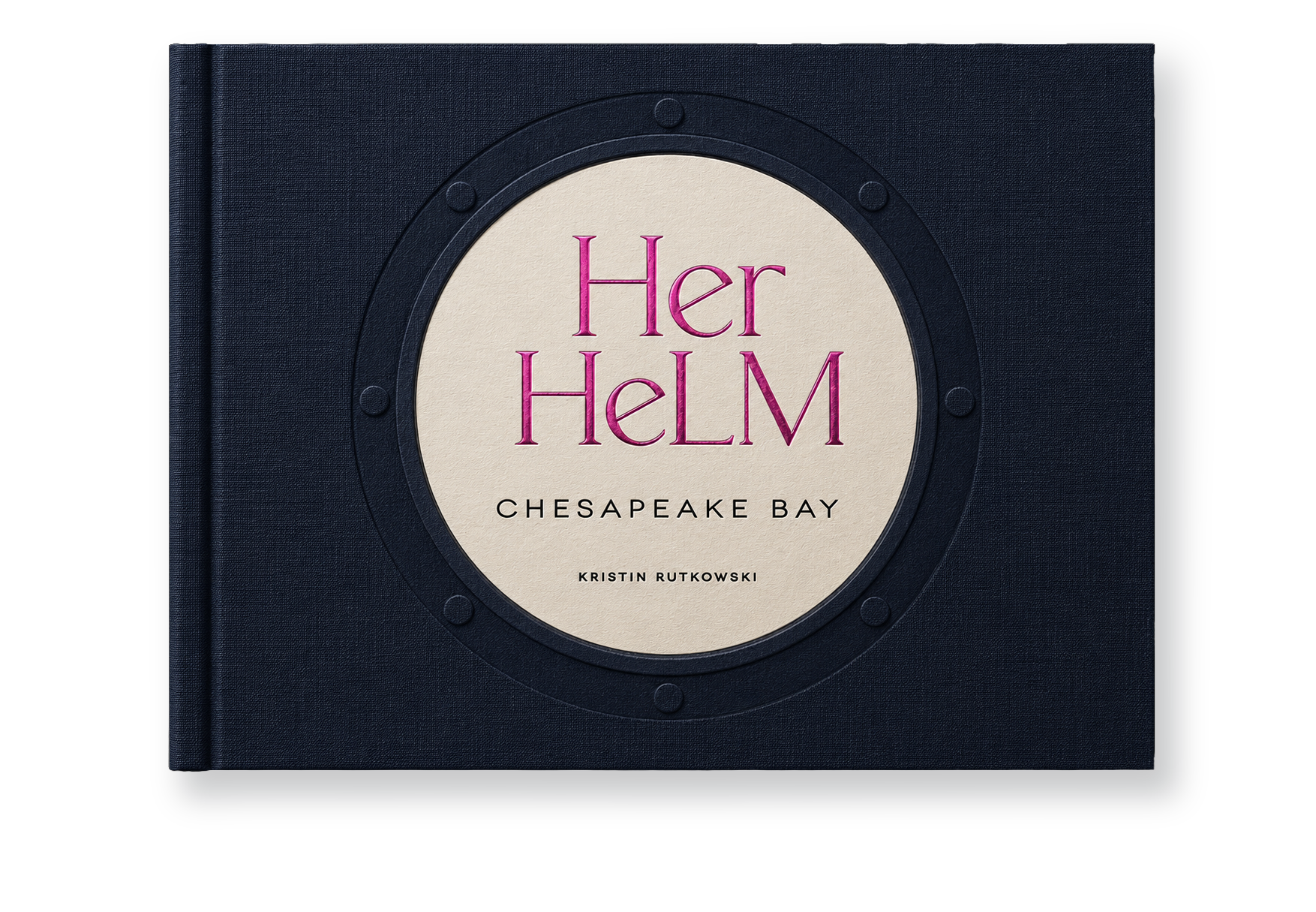
The cover. Deep blue linen, a debossed porthole with paper inset, and foil stamping in magenta and matte black: photo-free on purpose, unmistakable from across the room.
THE PROBLEM
Photographer Kristin Rutkowski had photographed 51 female boat captains of the Chesapeake Bay for Her Helm, and had pushed the project impressively far herself, including a first interior pass built by teaching herself InDesign. But she knew the book she envisioned needed professional design, and the clock was already running: a gallery show opening set the deadline, and we joined the project mid-stream, needing to get up to speed fast, deliver cover and interior concepts, and coordinate specialty printing in time.
THE APPROACH
We started with our discovery workbook and mood boards, distilling her goals to three words: minimalist, uplifting, feminine strength. The cover is deliberately photo-free so it reads clean and tactilely inviting even from across a gallery: deep blue linen with a debossed porthole holding a paper inset, stamped in two foils, a bold deep magenta for the title and a luxurious matte black for the subtitle and author; the spine is also foil-stamped in that rich magenta and a sleek matte silver, the silver carrying through to the back cover. Opening the book greets you with a deep magenta duotone mosaic of the captains, leading into clean, modern full-color interiors designed to elevate the women and their stories rather than eclipse them.
THE OUTCOME
Her Helm became more than a collection of portraits. The finished 168-page fine-art book created a lasting record of 51 women captains from across the Chesapeake Bay, giving Kristin Rutkowski's multi-year photography project a physical form designed to be collected, displayed, and preserved.
The project's reach continued well beyond publication. Her Helm was featured in a special exhibition at the Chesapeake Bay Maritime Museum from September 2023 through February 2026, accompanied by artist talks, panel discussions, and an oral-history initiative documenting the experiences of women featured in the project. Beyond documenting the captains individually, the project helped connect women across the region, many of whom had not realized how large their community was. It has also received regional media coverage and has grown into an ongoing documentary series, with the Chesapeake Bay as its inaugural edition.
"The cost of hiring an experienced designer was more than worth it. The entire book, inside and out, looks amazing." – Kristin Rutkowski, Photographer
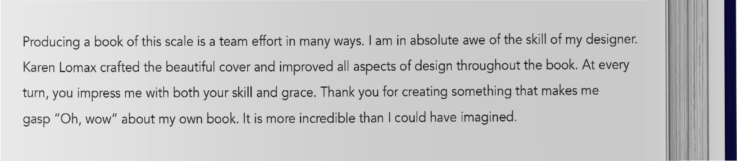
Working with Kristin was a delight, and books are our favorite kind of project. The cherry on top: she included a printed thank-you to her designer in the book itself.
51 Captains
WOMEN OF THE CHESAPEAKE BAY, EACH WITH PORTRAIT AND STORY
3 Foils
MAGENTA TITLE AND SPINE, MATTE BLACK DETAILS, SILVER SPINE AND BACK
Joined Mid-Project
ONBOARDED FAST, WITH CONCEPTS AND PRODUCTION ON ONE CLOCK
1 Opening Night
A GALLERY DATE THAT COULD NOT MOVE, AND DID NOT
Scope also included: cover and interior design, pre-press, concept development, creative direction, specialty printing coordination, print production management, opening-night gallery signage, and promotional giveaway selection (bags, bookmarks).
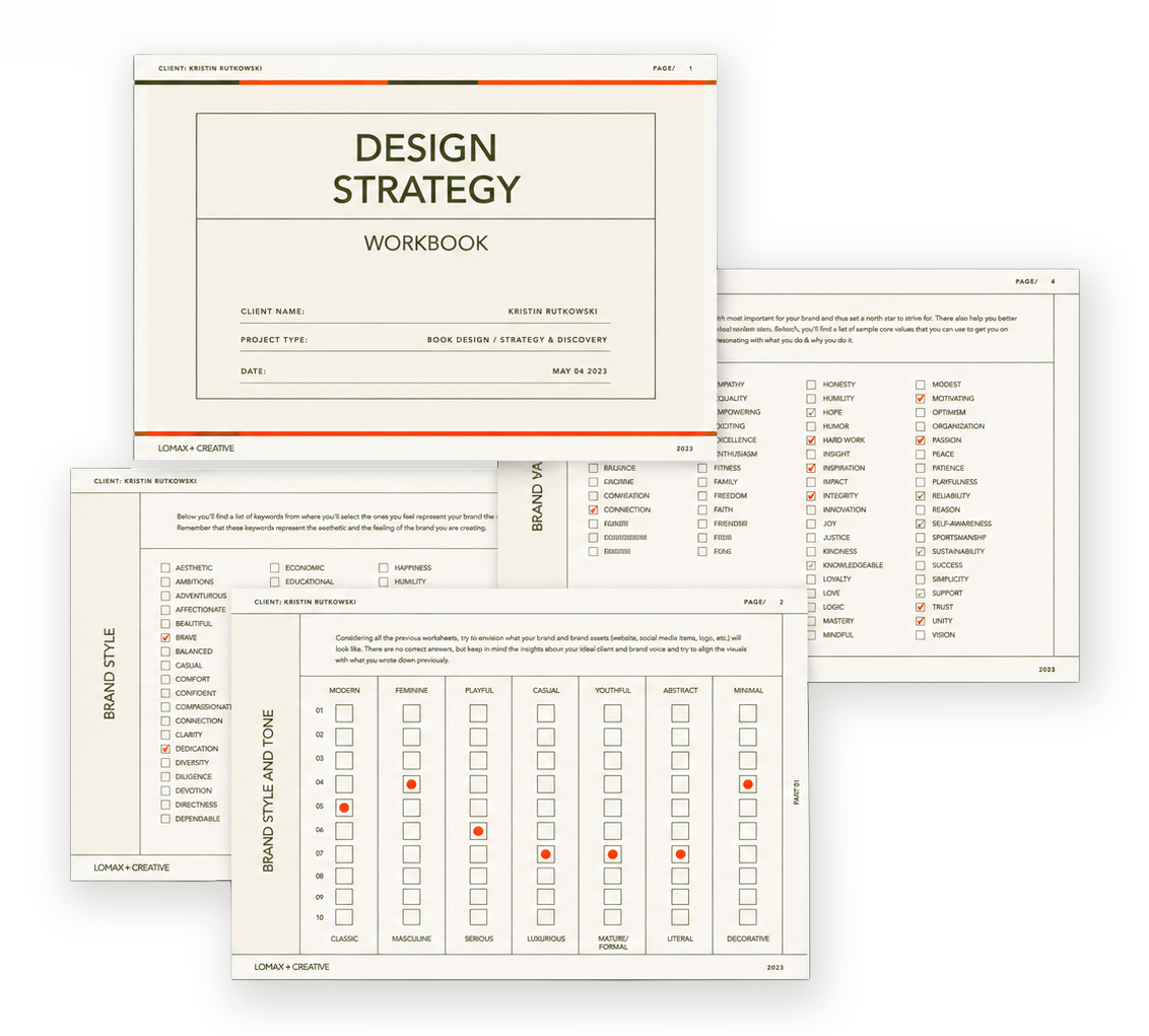
The discovery tools. Workbook and mood boards that turned instinct into direction: minimalist, uplifting, feminine strength.

The end sheets. A deep magenta duotone mosaic of the captains greeting the reader before a single story begins.
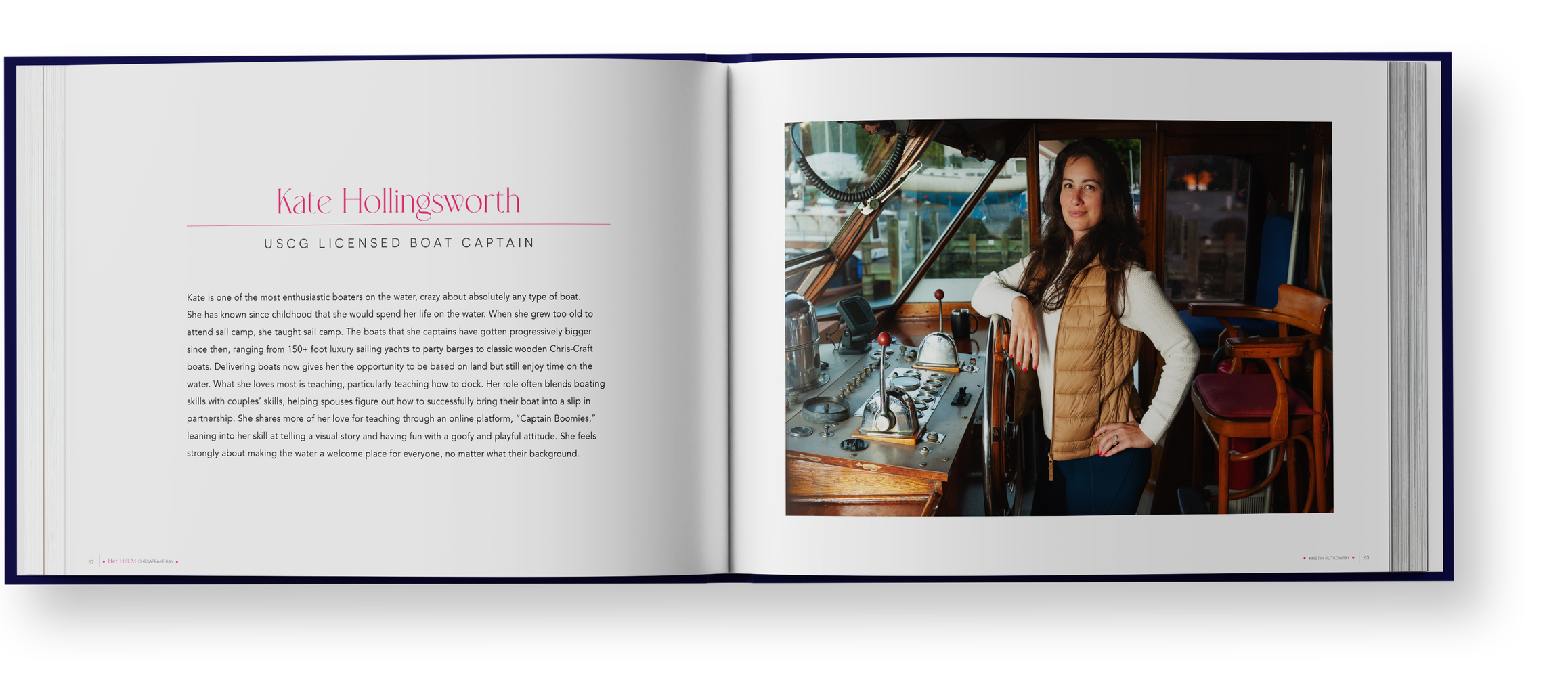
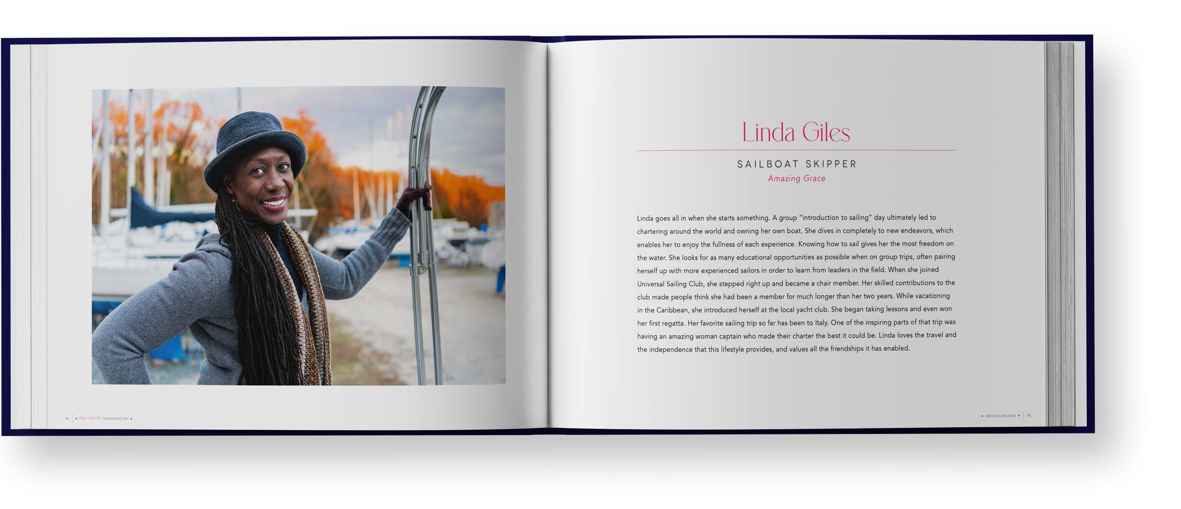

Interior spreads. Clean, modern layouts that put each captain and her story first.
Process note: Specialty finishes like a debossed inset and three foil stamps demand production management, not just specification: every technique adds a vendor conversation, a proof, and a chance for the schedule to slip. Coordinating those moving pieces against a fixed opening night is exactly the work twenty years in print prepares you for.
How We Work With Authors and Photographers
A book is the most personal thing we design, and we treat it that way. We start with a discovery session and mood boards to put words and images to what you want readers to feel, then design the cover and interior as one object. Twenty years in the print industry and thousands of pieces sent to press stand behind every job, so we can guide you confidently through the decisions self-publishing rarely prepares you for: paper stocks tested with your actual images, linen and foil and deboss options priced honestly, binding that suits how the book will be handled. We speak your printer's language and manage proofs and press checks through delivery, so the book in your hands matches the one in your head.

“Reaching out to Karen for help designing my “Her Helm” fine art portrait book was one of the best things I could have done for my book. Her creative genius saw into my thoughts and then came up with something that perfectly reflects how I want people to feel when holding this book. From the beginning, she was supportive and professional, and had brilliant methods to get me to describe my goals so that she could do her magic. It was an iterative process to create the final design, which was absolutely stunning. The cost of hiring an experienced designer was more than worth it. The entire book, inside and out, looks amazing due to her skills and I’m grateful for everything she has done to elevate my book.”
Planning a book like this?
Thirty minutes, no obligations. We'll talk about your images, your materials wish list, and what it takes to hold the book you're imagining.