

CASE STUDY / BOOK DESIGN
The Lid: A Business Book Cover That Doesn't Look Like One
RYAN ROGHAAR • THE LID • PRINT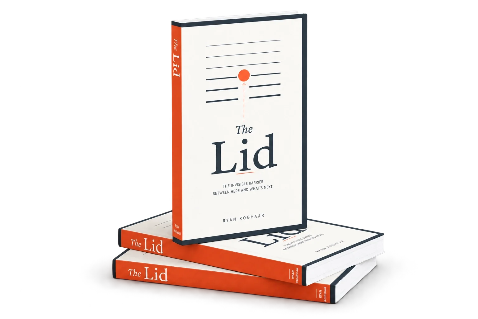
The winning cover. Navy typography on warm cream, an orange dot breaking through a stack of thinning horizontal lines: the book's central metaphor drawn as one image.
THE PROBLEM
Ryan Roghaar is a graphic designer, an author, and a friend. When he set out to publish The Lid, a business book built from his podcast conversations about the invisible barrier that stalls capable people in business, leadership, and identity, he ran into the problem every designer knows too well: designing your own cover is close to impossible. He handed us the manuscript and the metaphor, and asked for a cover that would be credible as a business book without falling into the expected corporate look.
THE APPROACH
We developed three original cover concepts, each a different visual take on the metaphor: a stacked-line system, a rising bar chart breaking through a ceiling, and a topographic map with a route past the lid. Ryan chose the stacked-line system, and we refined it from there. Stacked horizontal lines stand in for the recurring barriers a reader confronts as they grow. The bottom line is the thickest, and each row above thins, so the stack visualizes the book's argument: the lid becomes less limiting as clarity and confidence build. An orange dot represents the reader breaking through, and a dotted arrow marks upward movement. We paired dark navy typography with warm cream space, and chose a saturated bright orange rather than a corporate tone: warm on the cover, and unmistakable as a spine on a business-book shelf. Inside, the InDesign template carries one signature move: each chapter opener has one fewer lid line than the one before, so by the last chapter the lids are gone.
THE OUTCOME
A business book that carries a single idea from spine to final chapter without ever looking like a business book. Ryan was instantly drawn to the winning direction. We delivered the InDesign template and he flowed his manuscript in himself, keeping his self-publishing scope efficient.
ORIGINAL CONCEPTS EXPLORED, ONE REFINED INTO THE FINAL COVER
3 Directions
One Less Line Per Chapter
INTERIOR MOTIF THAT ENACTS THE BOOK'S CENTRAL IDEA
Bright Orange Spine
WRAPS ONTO THE BACK COVER FOR SHELF PRESENCE IN A CATEGORY OF DEFAULTS
Template Built to Flow
INDESIGN SYSTEM SO THE AUTHOR COULD POUR IN HIS OWN MANUSCRIPT
Scope also included: cover design, interior template design, concept development, and creative direction.
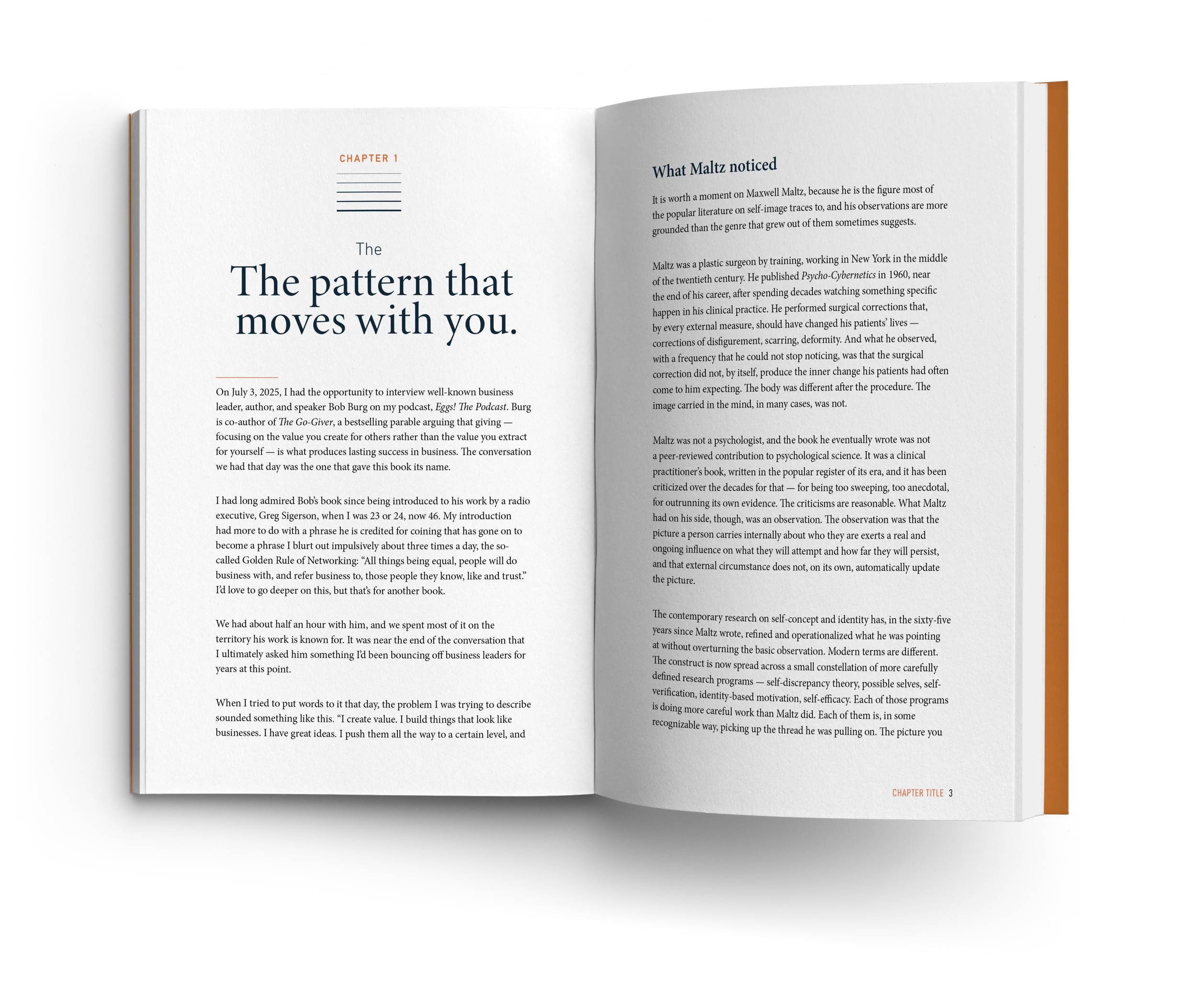
Final interior. Each chapter opener carries a stack of lid lines, and each new chapter loses one, so the lids gradually disappear as the reader moves through the book.
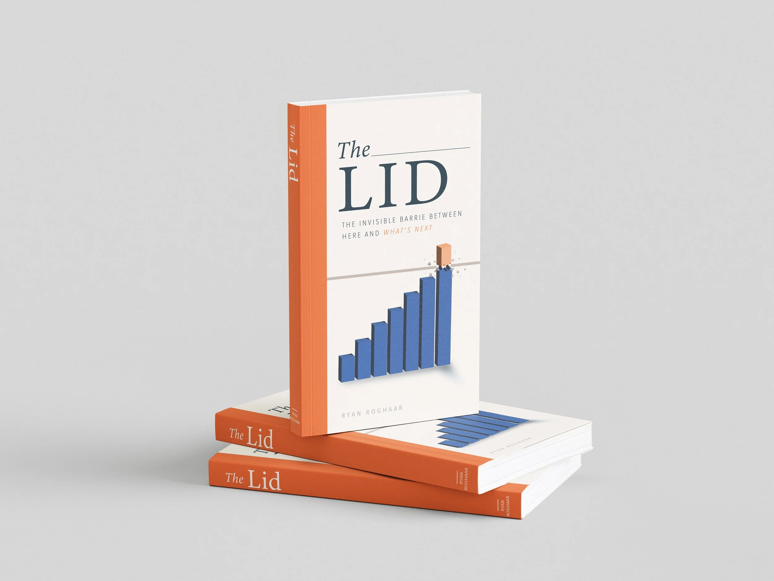
Second Cover Option. A rising bar chart breaks through the horizontal lid line: a familiar business visual given a more dimensional twist.
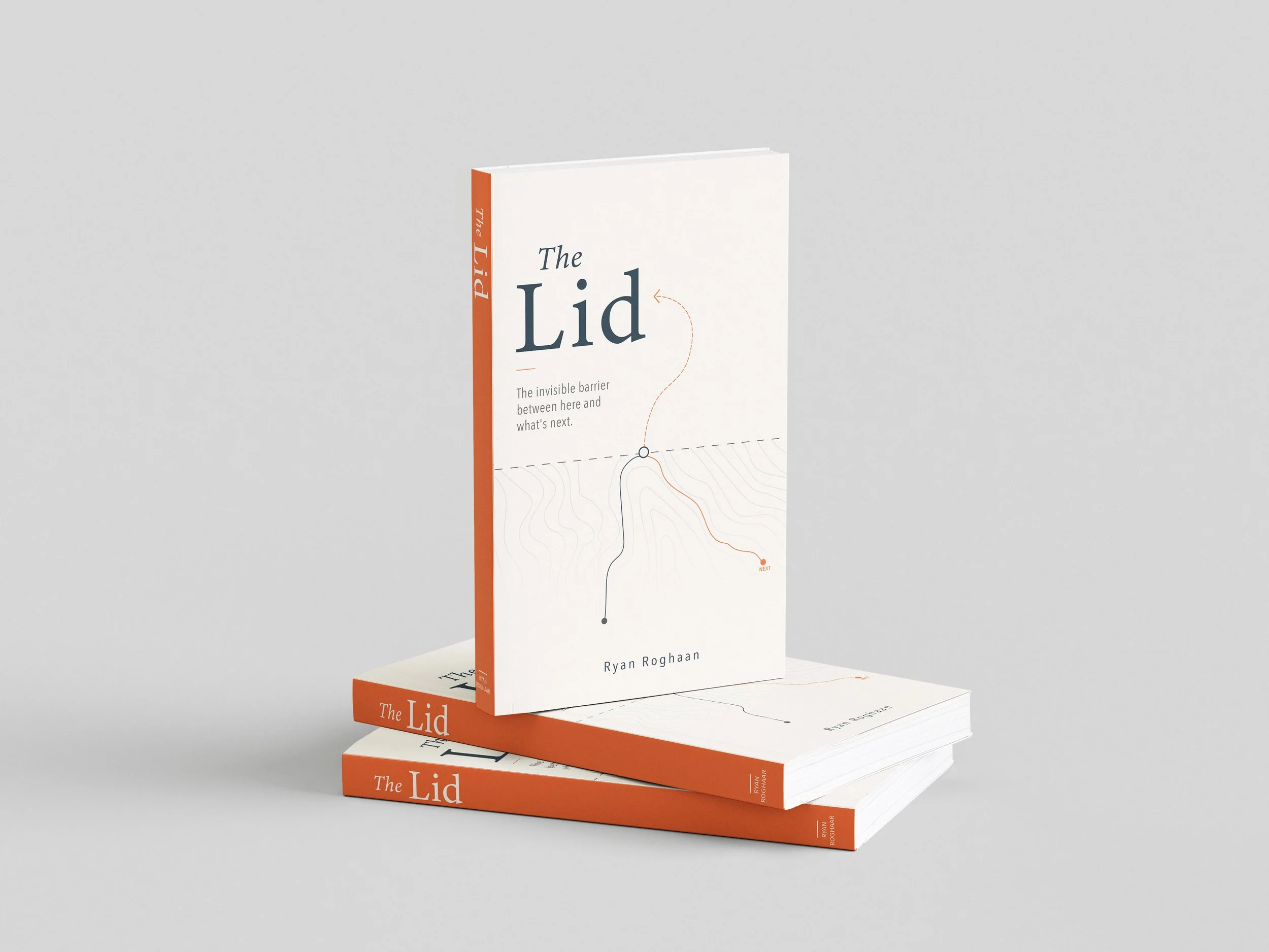
Third Cover Option. A topographic map with a plotted orange route past a dotted-line lid, framing being stuck as a map problem that needs a new path.
Process note: Ryan's book is about a single, precise idea: the moment growth stalls against an invisible barrier. The whole visual system was built to enact that idea rather than illustrate it. The dot breaks through on the cover, the stacked lines thin as they rise, and each interior chapter drops one more line until they're gone. The book's argument doesn't sit next to the design. It moves through it.
How I Work With Authors And Photographers
A book is the most personal thing I design, and I treat it that way. We start with a discovery session and mood boards to put words and images to what you want readers to feel, then I design the cover and interior as one object. Because I bring twenty years in the print industry, I can guide you confidently through the decisions self-publishing rarely prepares you for: paper stocks tested with your actual images, linen and foil and deboss options priced honestly, binding that suits how the book will be handled. I speak your printer's language and manage proofs and press checks through delivery, so the book in your hands matches the one in your head.
Planning a book?
Thirty minutes, no obligations. We'll talk about your images, your materials wish list, and what it takes to hold the book you're imagining.