

CASE STUDY / RESEARCH REPORT DESIGN
Making Student Voices the Loudest Element
TEACH PLUS • SEEING MYSELF • PRINT + DIGITAL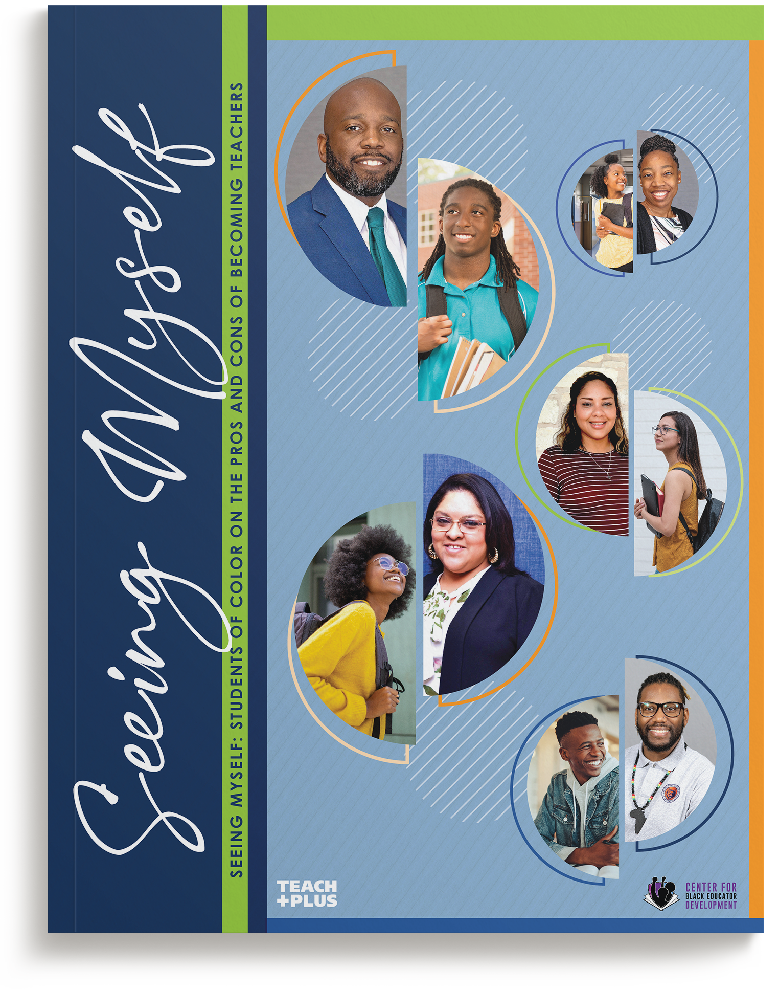
The chosen cover. A divided circle pairs each student with a teacher who mirrors them. Built entirely within the Teach Plus brand palette.
THE PROBLEM
Teach Plus needed a report amplifying students’ perspectives on diversifying the teacher workforce, designed in three to four weeks, with no budget for an independent photo shoot.
THE APPROACH
Within days, we presented two concepts; the chosen direction built the whole system around a divided-circle motif of a student and teacher mirroring one another, sourced imagery that broke from stock-photography clichés, and set the student quotes in high-contrast brand colors so their voices lead every page.
THE OUTCOME
Delivered early, giving the team extra runway for their outreach plan, in a client relationship now in its sixth year.
3–4 Weeks
CONCEPT TO DELIVERED FILES
2 Concepts
PRESENTED WITHIN DAYS OF KICKOFF
Early
DELIVERY, ADDING OUTREACH RUNWAY
6th Year
OF ONGOING CLIENT REPORT WORK
Scope also included: launch social media graphics, a PowerPoint presentation, and a one-page brief for the media toolkit.
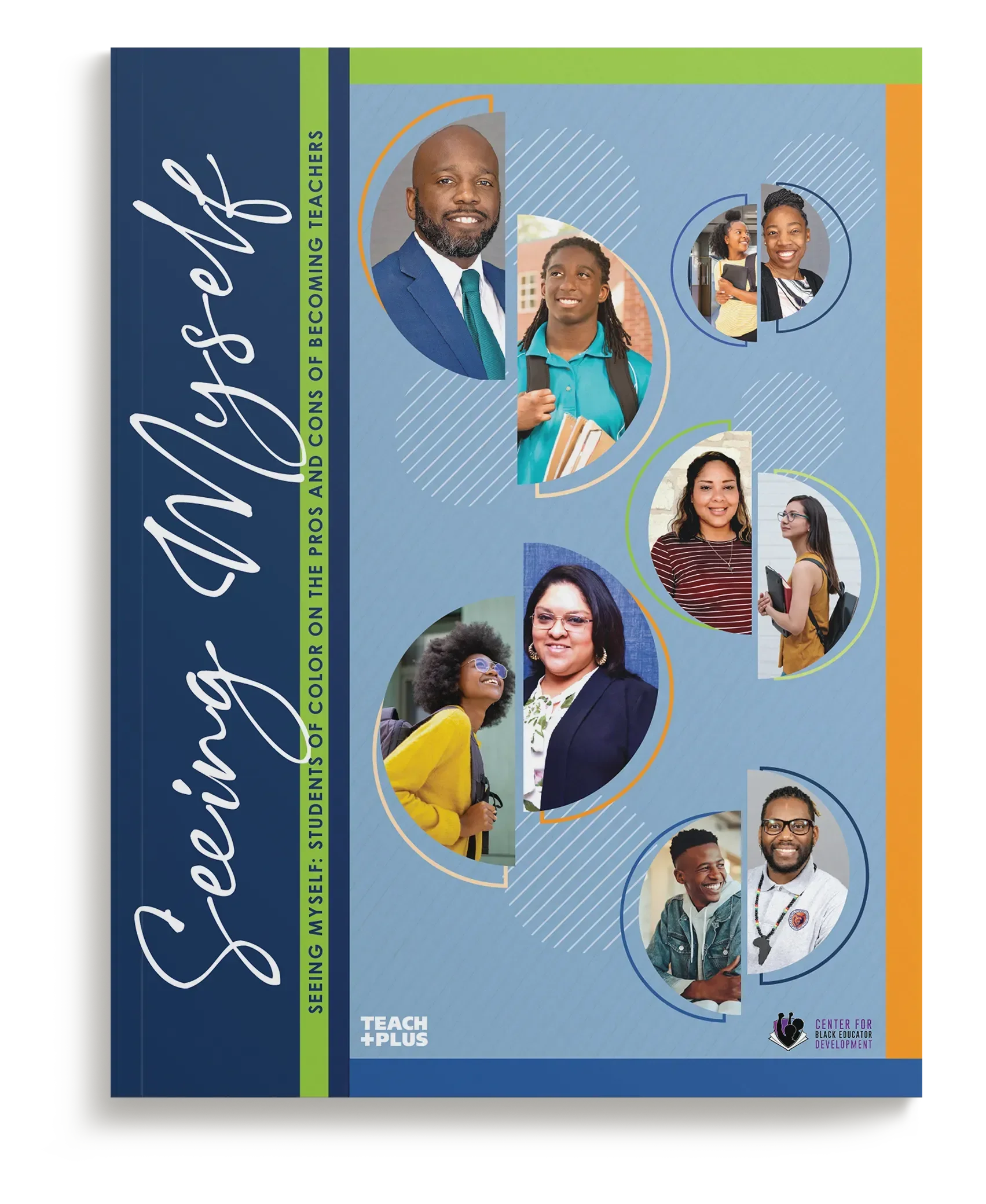
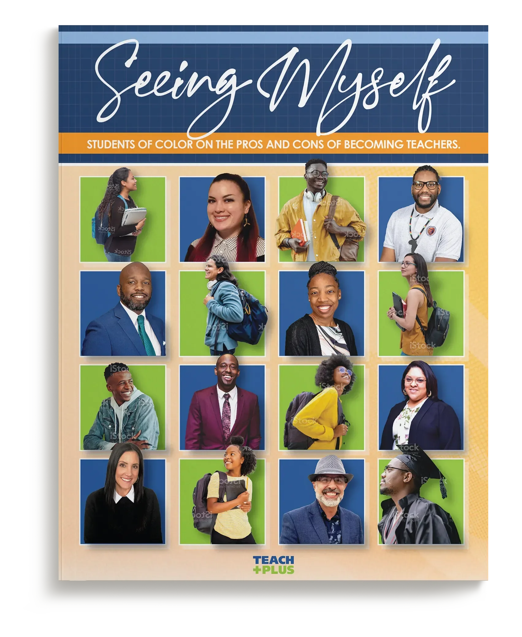
Two full directions, not sketches. Both concepts arrived developed enough to choose from with confidence, so review time stayed on schedule.
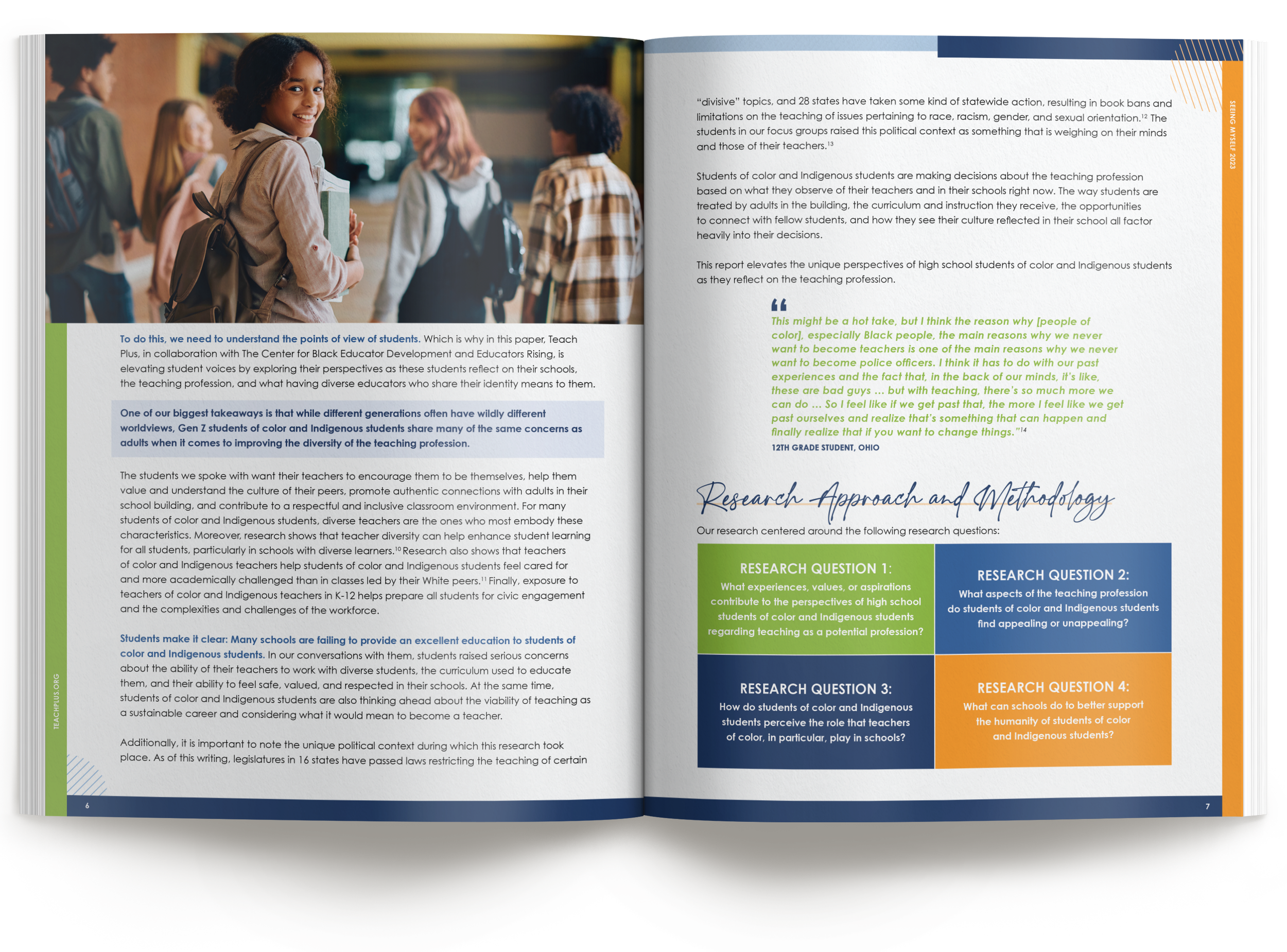
Methodology built for skimming. The research approach restructured into color-blocked question cards so the study design reads before the paragraphs do.
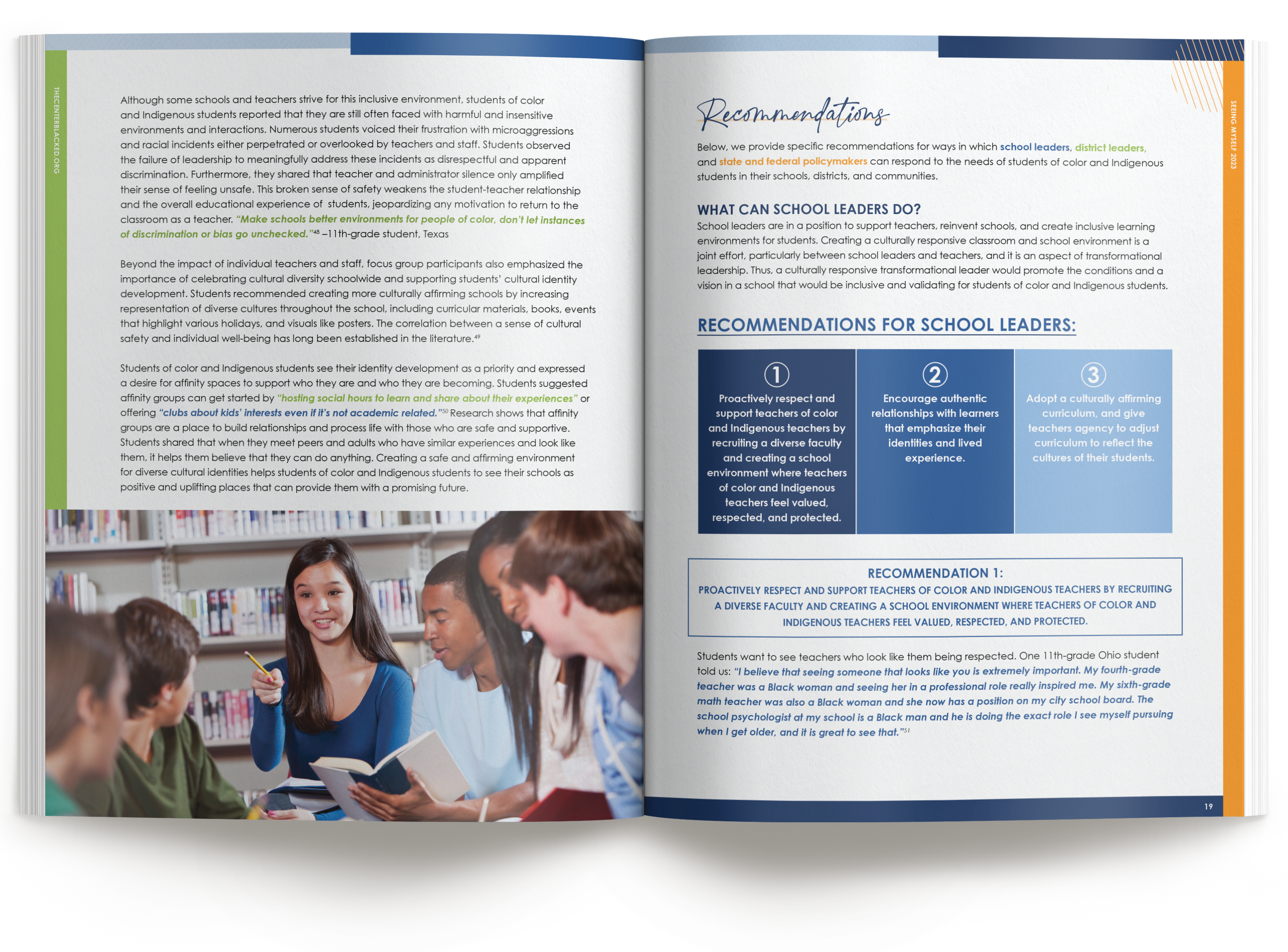
Quotes as the loudest element. Students' voices set in high-contrast brand colors, doubling as design elements that carry the report's core message.
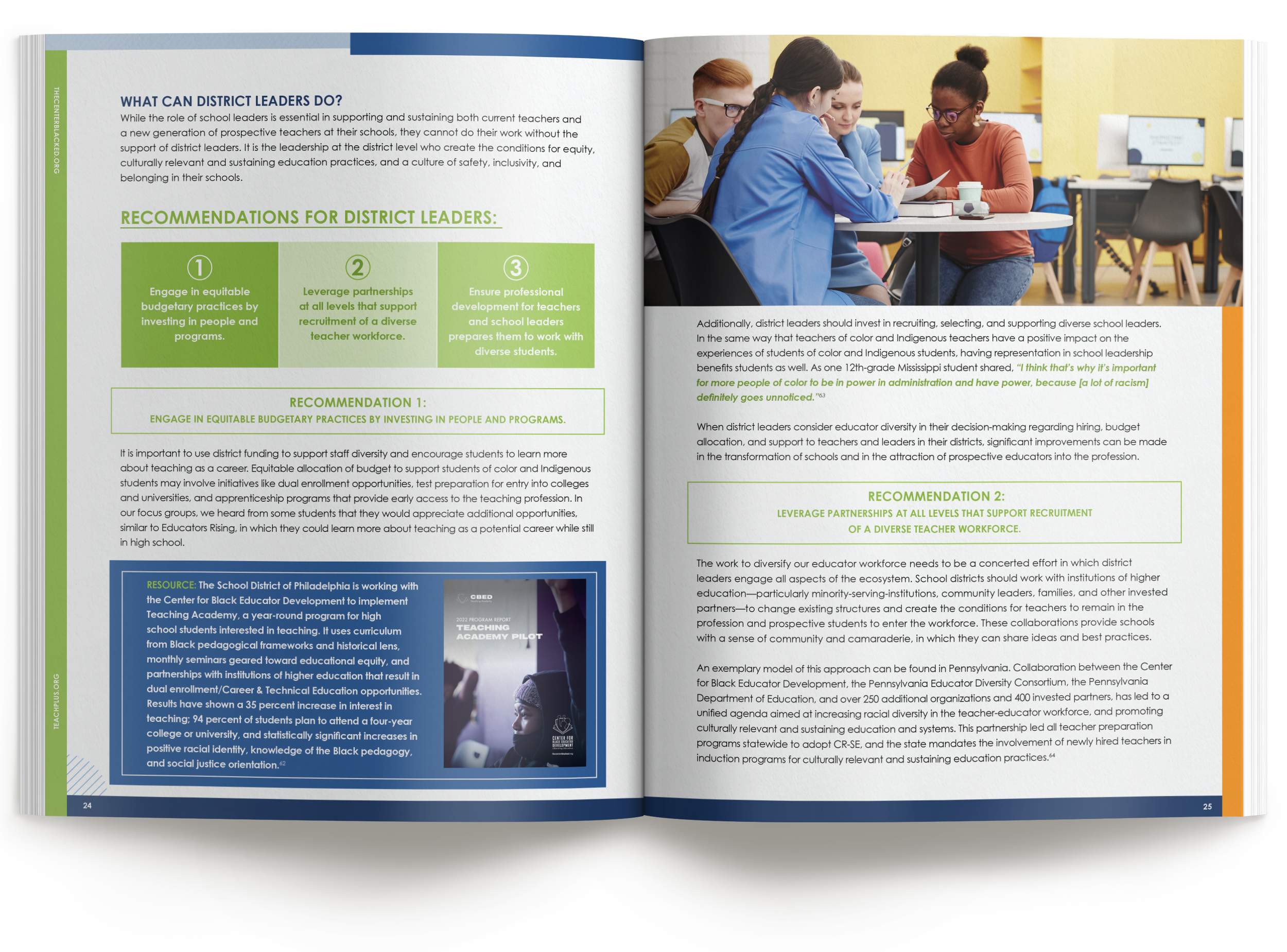
Recommendations that survive a fast read. Actions for school leaders, broken into numbered, color-coded cards for decision-makers who skim.
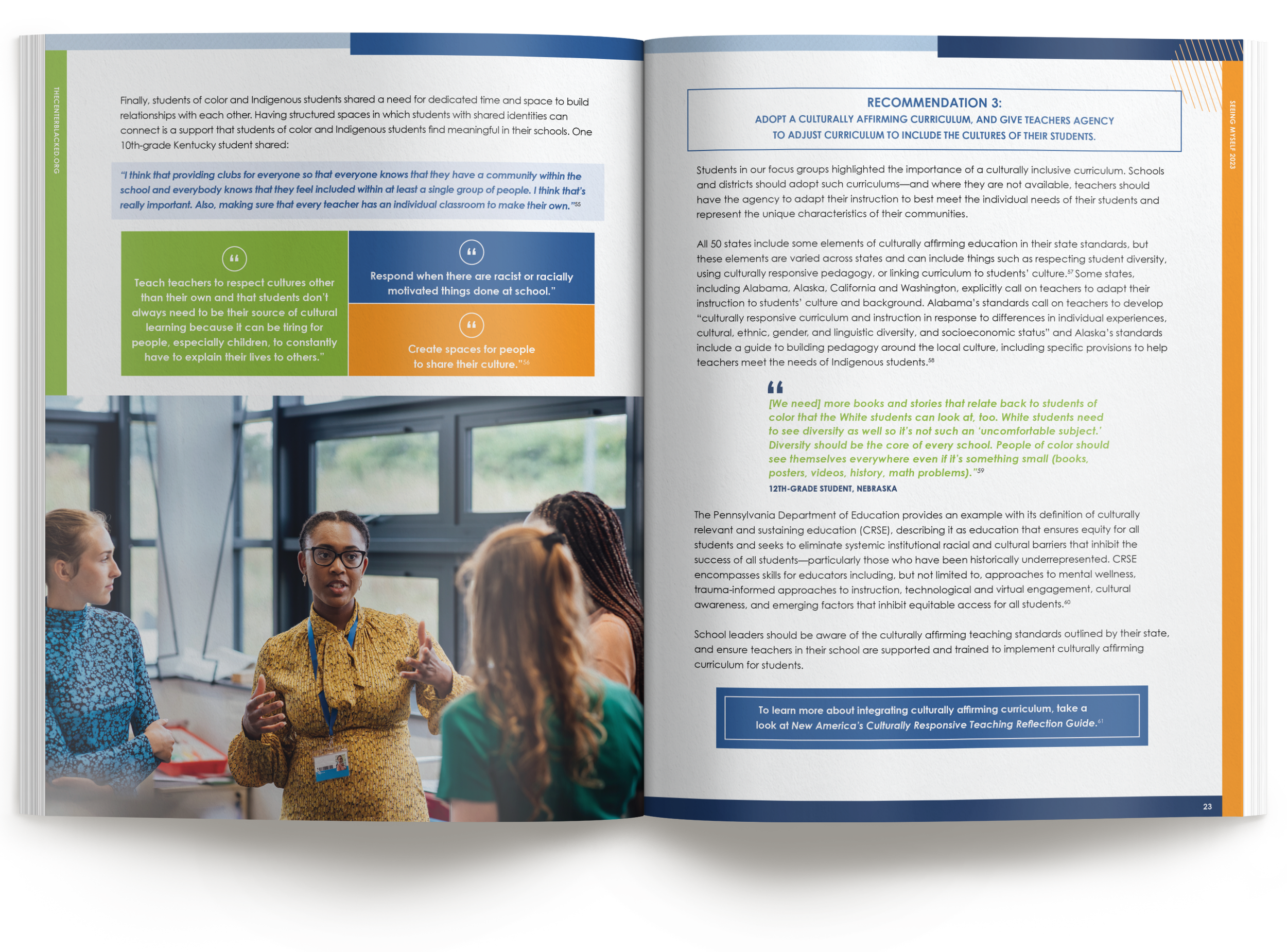
Imagery without a photo budget. Photography sourced and cleared to break from stock clichés, anchoring the district leaders' recommendations.
Process note: A report built on student voices leans hard on its photography, and this one had no budget for a shoot. When you can't commission images, the work moves upstream: build the visual system first, then source every photo to fit it. We set the divided-circle motif and a fixed color and cropping treatment before choosing a single image, so sourced photography read as one deliberate set rather than stock. That system then carried past the report into the launch social graphics, the PowerPoint, and the media brief, so everything looked custom without a custom shoot.
Where it went. After launch, the report's findings were picked up by Education Week and K-12 Dive, carrying the students' perspectives to a national audience of education leaders. It was later selected for an educator-workforce toolkit hosted on a U.S. Department of Education platform, under the priority "Invest in a Talented and Diverse Teacher Pipeline." Clear design helped a focus-group study travel from the page into national media and a federal resource collection.
How We Work With Research Teams
Most engagements begin with a manuscript: Word files, Excel charts, reviewer comments, and all. We build the page architecture around your content's structure, redraw figures from your data or from exported charts as publication-quality graphics in your brand, and manage edits with rounds against a tracked-changes PDF so feedback from multiple reviewers lands cleanly. Twenty years in the print industry and thousands of pieces sent to press stand behind every job. We speak your printer's language, spec the job so it prints the way it was designed, and manage estimates, proofs, and press checks through delivery, holding costs on budgets large and small. Fixed launch dates are treated as fixed.
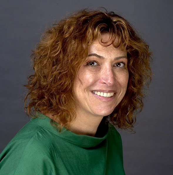
“We’ve worked with Karen on multiple large-scale design projects such as annual reports and national research reports. In every instance, Karen has kicked off the work with strong conceptual presentations that demonstrated her deep understanding of our field and of our thought leadership goals when it comes to design. Karen then remained flexible and open to feedback throughout the entirety of the design and editing process, making it easy for us to coordinate changes and improvements. We especially appreciate how fast Karen works and her close attention to detail to ensure copy accuracy throughout multiple rounds of edits. Our entire team knows and trusts Karen to deliver on-brand work that elevates our visual presence among our partners, influencers, and other key audiences.”
Planning a report like this?
Thirty minutes, no obligations. We'll talk about scope, timeline, and what your content needs to land.