
CASE STUDY / HEALTH COMMUNICATION DESIGN
Putting Women in Front
PATH • GLOBAL CAMPAIGN FOR MICROBICIDES • IN WOMEN'S HANDS • BOOKLET + MEDIA PACKAGING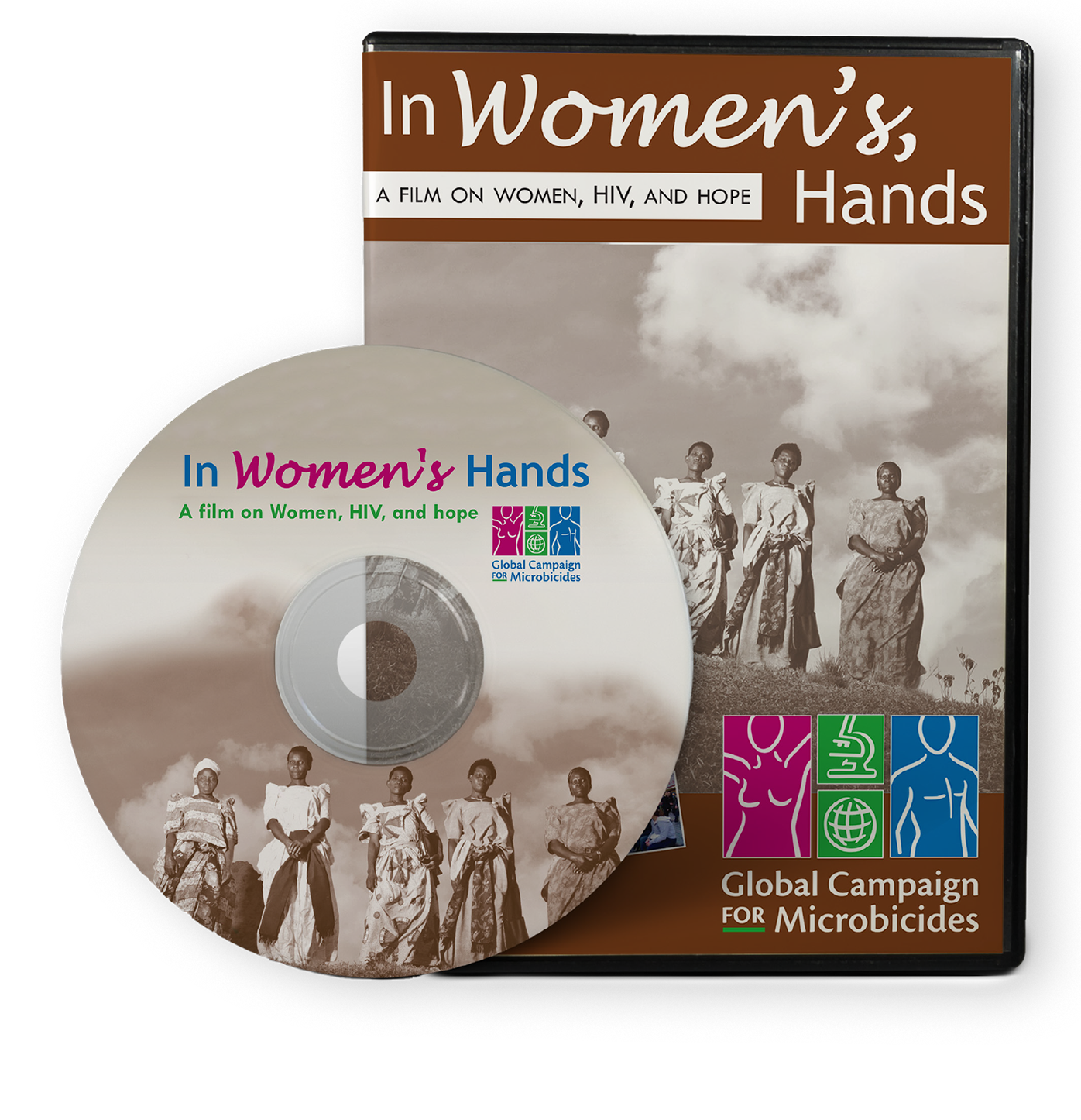
The cover. Sepia for gravitas, with the brand's color logo bold on the piece.
THE PROBLEM
PATH's Global Campaign for Microbicides produced "In Women's Hands," a short film on HIV's impact on women and the urgent need for prevention methods women can control themselves. The film and an accompanying discussion guide would travel to health workers and advocates for community screenings, first with African women at its center and ultimately in 50 countries. The design brief came down to one rule we hold on work like this: serve the message, never upstage it.
THE APPROACH
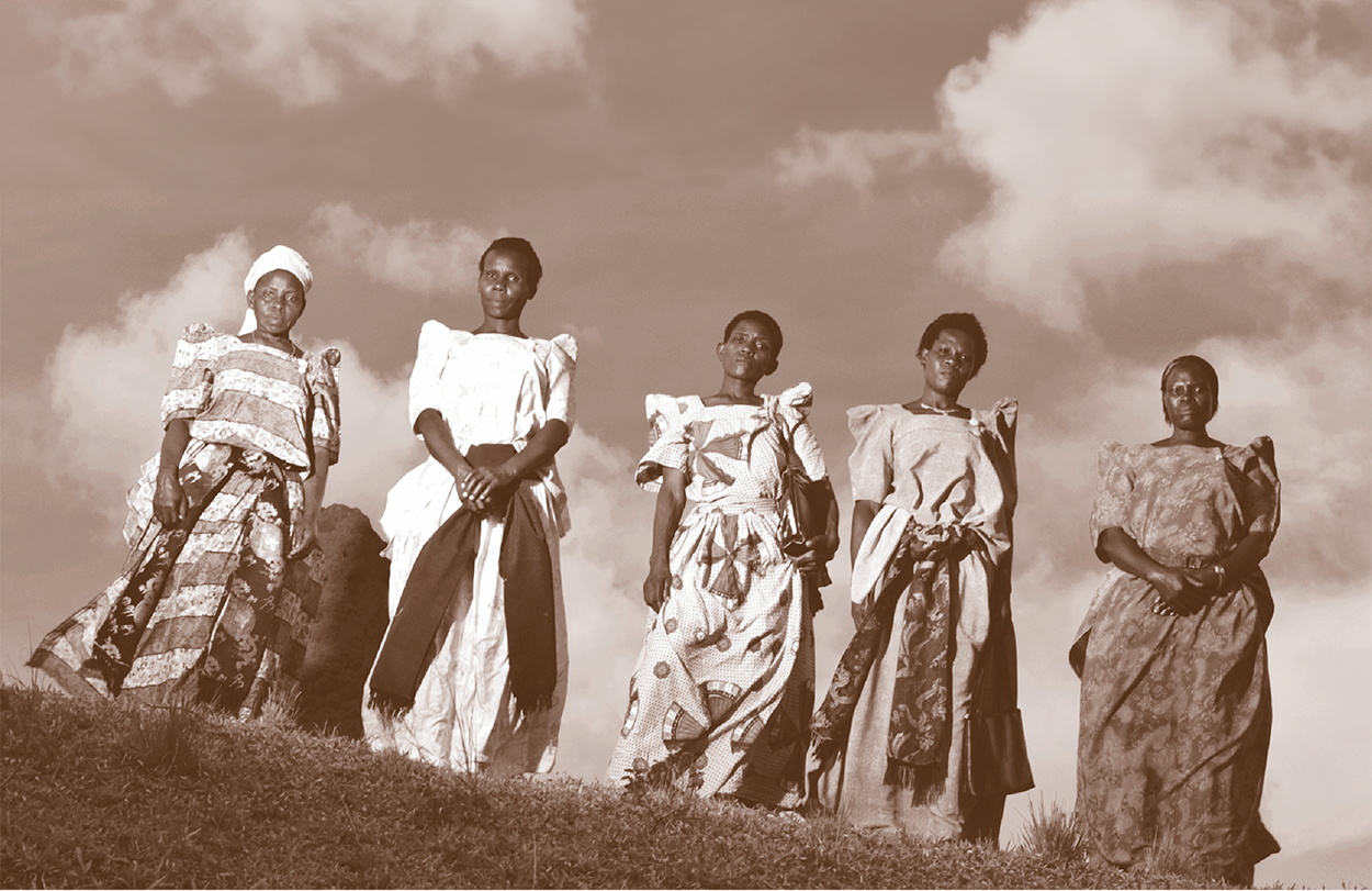
From the photography provided, we chose a main image of a group of women shot from below, placing them on a higher plane than the viewer, a quiet signal of power and community. We treated the DVD and booklet covers in sepia, which lends gravitas and lets magenta pulled from the logo carry as the one accent on the piece. Inside, the booklet balances text with images of front-line health workers that double as visual transitions between sections, and that same magenta marks women taking proactive steps toward their health, used sparingly so it always means something.
THE OUTCOME
By 2012, more than 800 copies had been distributed and screened in over 185 cities across 50 countries, each one paired with the discussion guide so a local advocate could host a screening and lead the conversation after. The film was translated into Spanish, then Hindi and Tamil. Built as an advocacy tool rather than a documentary, it shipped in short and long cuts, on DVD and VHS, in the formats each region could actually play, which is what let one design reach that many rooms.
800+ Copies
DISTRIBUTED AND SCREENED WORLDWIDE BY 2012
185+ Cities
ORGANIZED SCREENINGS ACROSS 50 COUNTRIES
3 Languages
TRANSLATED INTO SPANISH, HINDI, AND TAMIL
One System
BOOKLET, DVD, AND VHS DESIGNED TO PLAY IN EVERY REGION
Scope also included: booklet cover design, interior layout, DVD and VHS packaging design, concept development, creative direction, and photo editing.
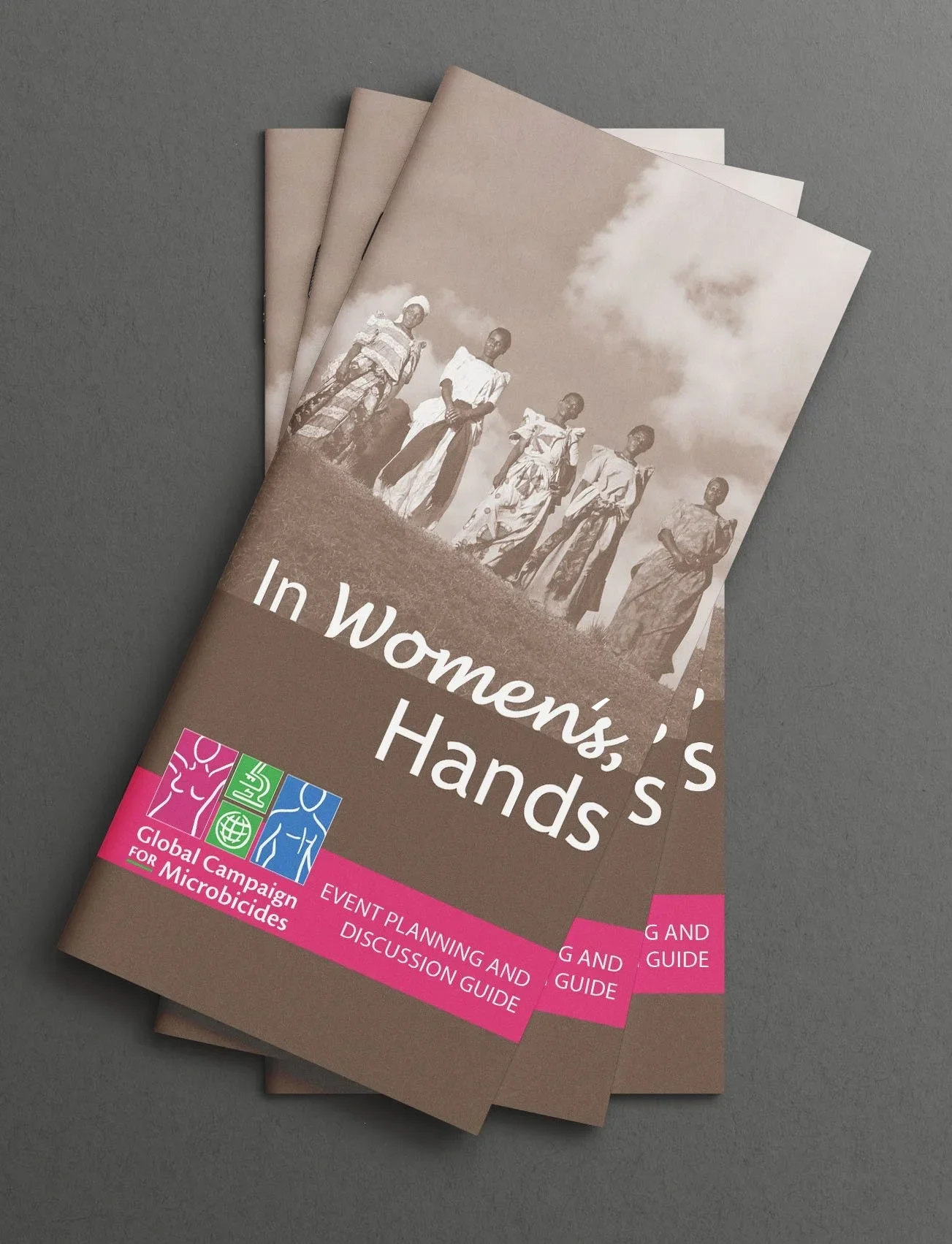
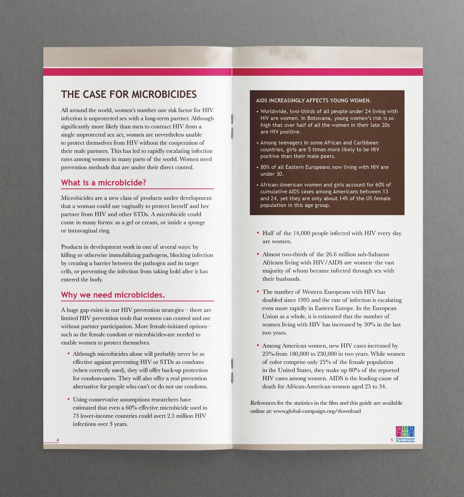
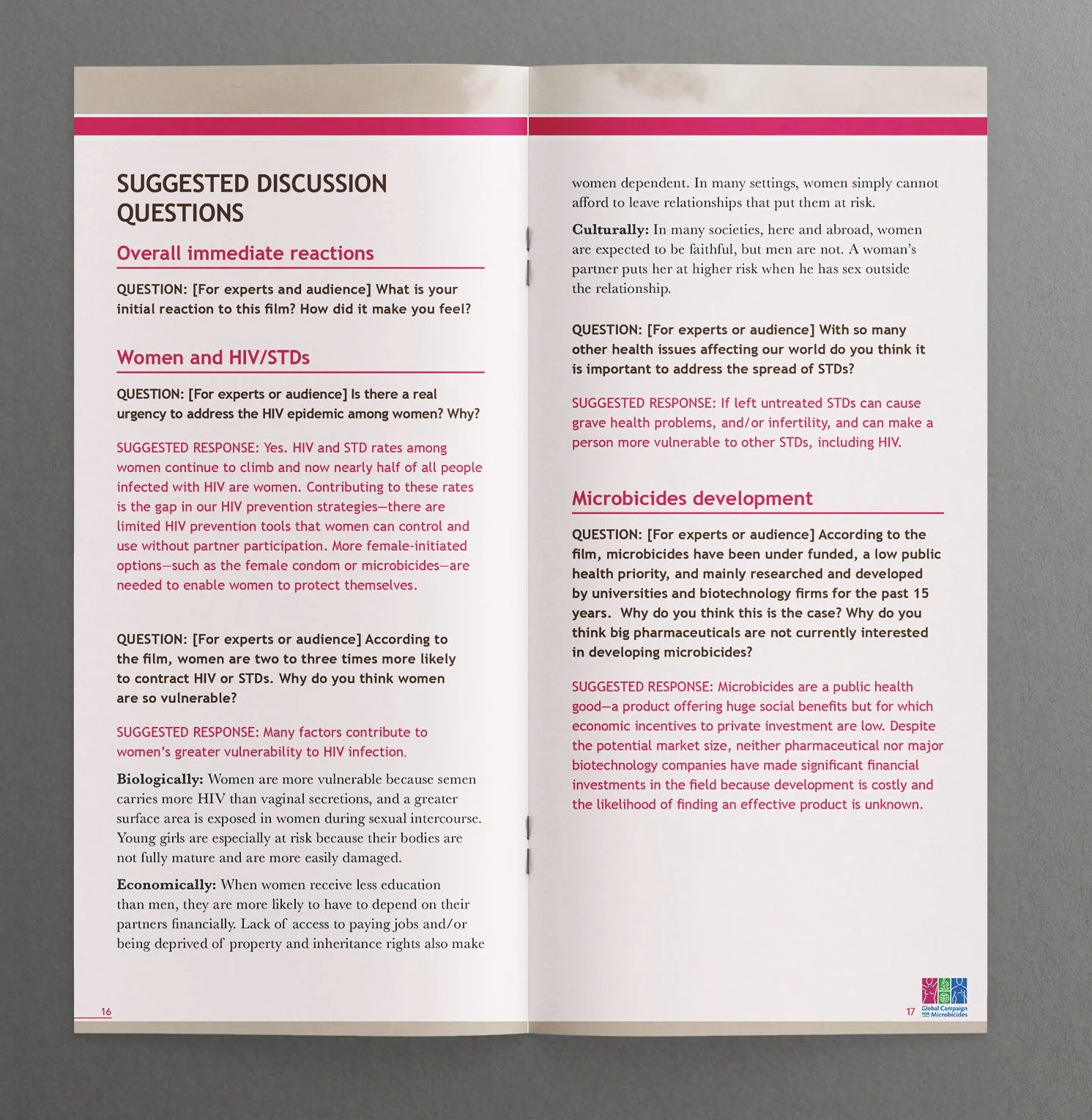
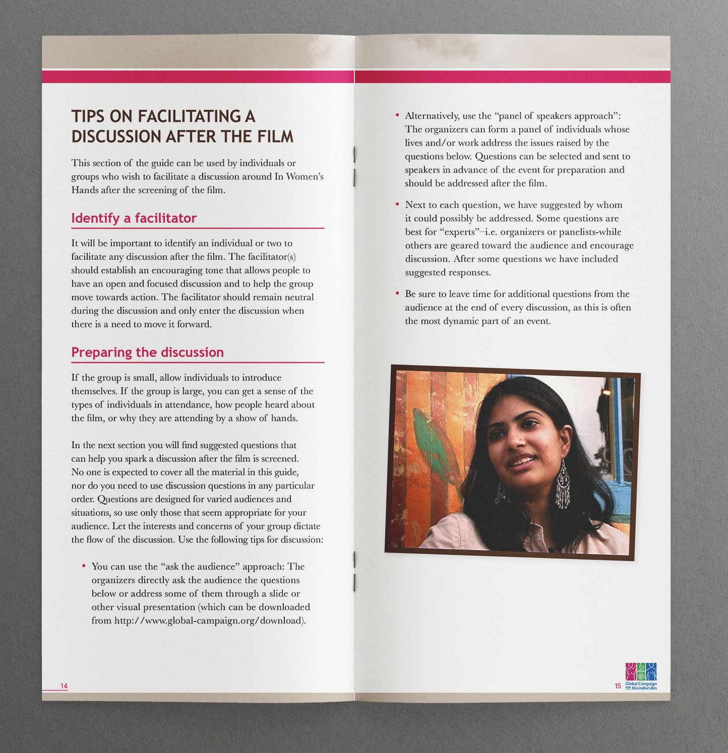
The discussion guide cover and interior. The cover design mirrors the DVD cover. On the interior, the statistics are presented as a scannable case, front-line health workers carry the reader between sections, and pink brand accents mark the suggested questions, so the booklet is built for group discussion and equips a facilitator to run the screening.
Process note: Some projects call for a designer's restraint more than their flourish. Every choice here, the sepia covers, the magenta pulled from the logo as the main accent color, the elevated camera angle, was made so that a health worker holding this booklet in a community gathering has the audience's attention on the message, not the design.
How We Work With Communications Teams
Most engagements begin with a manuscript: Word files, statistics, photo folders, and a brand guide. We build the design system around your content's structure, turn your data into publication-quality graphics in your brand, and manage edits through clearly versioned rounds so nothing gets lost between drafts. Twenty years in the print industry and thousands of pieces sent to press stand behind every job. We speak the printer's language, spec the job so it prints the way it was designed, and manage estimates, proofs, and press checks through delivery, holding costs on budgets large and small. Fixed launch dates are treated as fixed.
Planning collateral that has to work harder?
Thirty minutes, no obligation. We'll talk about your audience, your budget, and what the piece needs to accomplish.