

CASE STUDY / ANNUAL REPORT DESIGN
Letting People Carry the Story
TEACH PLUS • A YEAR OF IMPACT • PRINT + DIGITAL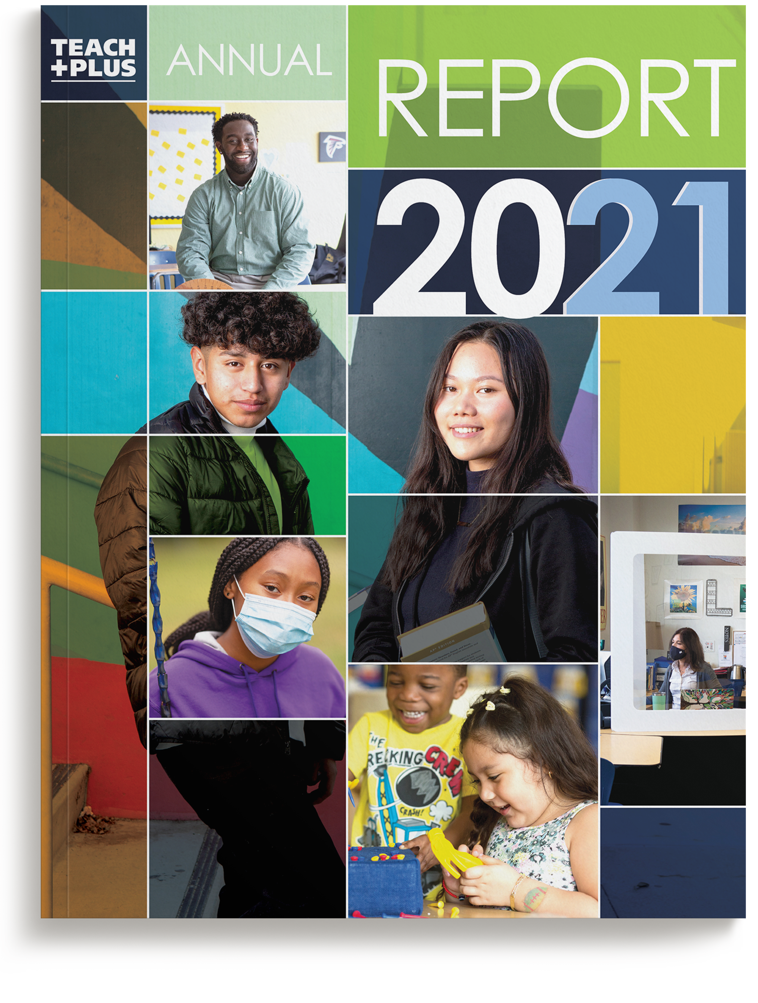
The chosen cover. A gridded photo system anchored by two students, color-blocked entirely within the Teach Plus brand palette, sets the energetic tone that carries through the interior.
THE PROBLEM
Teach Plus needed a donor-facing annual report that distilled a year of nationwide work into a celebratory, people-first piece: one that champions educators and inspires continued support, with only three weeks to get from kickoff to an approved design.
THE APPROACH
We presented two contrasting directions: one led by photography, built on a bold grid anchored by a large image of two students, and one led by typography, setting the year in large type in the brand palette with photography in a supporting role. Teach Plus wanted the human element at the heart of the organization front and center, so the photographic grid won. From the first sketch, we placed full- and half-page photographs to guide the reader through the report, locked the page count for print, and managed the job through to press.
THE OUTCOME
The report became a centerpiece of that year's fundraising and marketing, and the print-planned layout held costs to budget through seven rounds of client copy edits.
3 Weeks
KICKOFF TO APPROVED DESIGN
2 Concepts
A PHOTO-LED DIRECTION AND A TYPE-LED DIRECTION, FULLY DEVELOPED
7 Rounds
OF COPY EDITS ABSORBED WITHOUT MISSING THE PRESS DATE
Print + Digital
ONE LAYOUT, BUILT FOR PRESS AND ADAPTED FOR SCREEN
Scope also included: creative direction, photo editing and sourcing, complete print production management, and a digital edition.
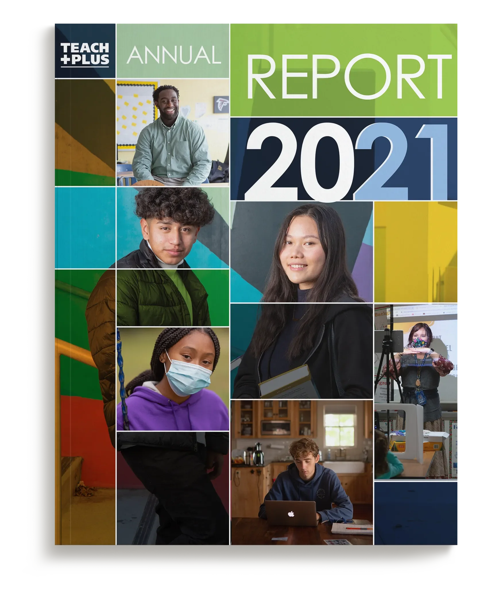
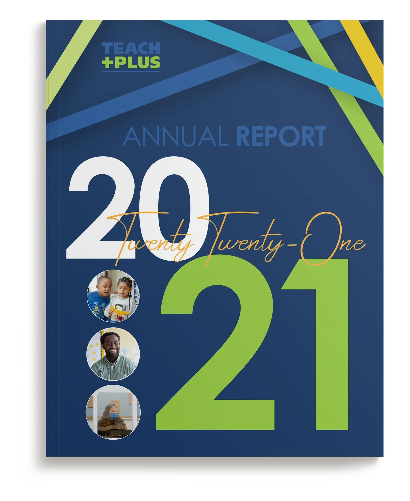
Two full directions, not sketches. One cover let photography lead, a bold grid anchored by two students; the other let typography lead, the year set large with small circular portraits in support. Both were developed far enough to choose with confidence.
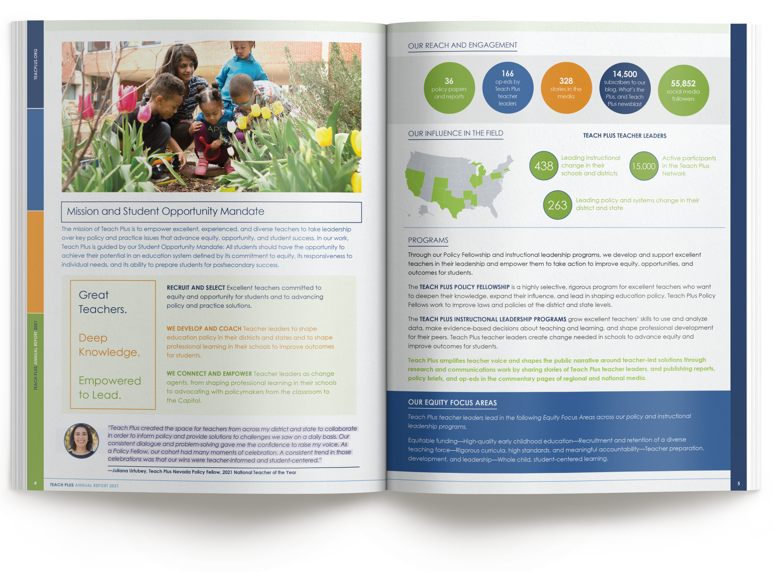
Quotes that read like highlights. Teacher voices are set with a highlighted text effect and paired with photography, so personal stories stand out from the statistics.
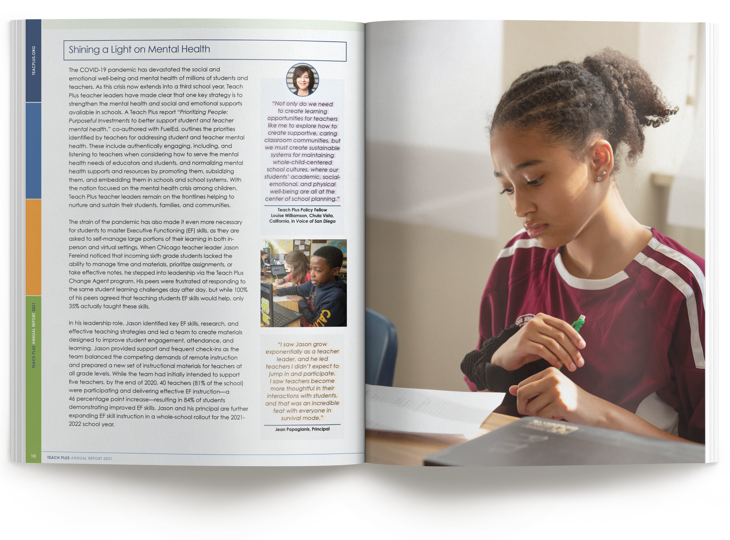
Color blocking that organizes, not decorates. The cover's grid carries through the interior, guiding the eye through prioritized content and callout boxes.
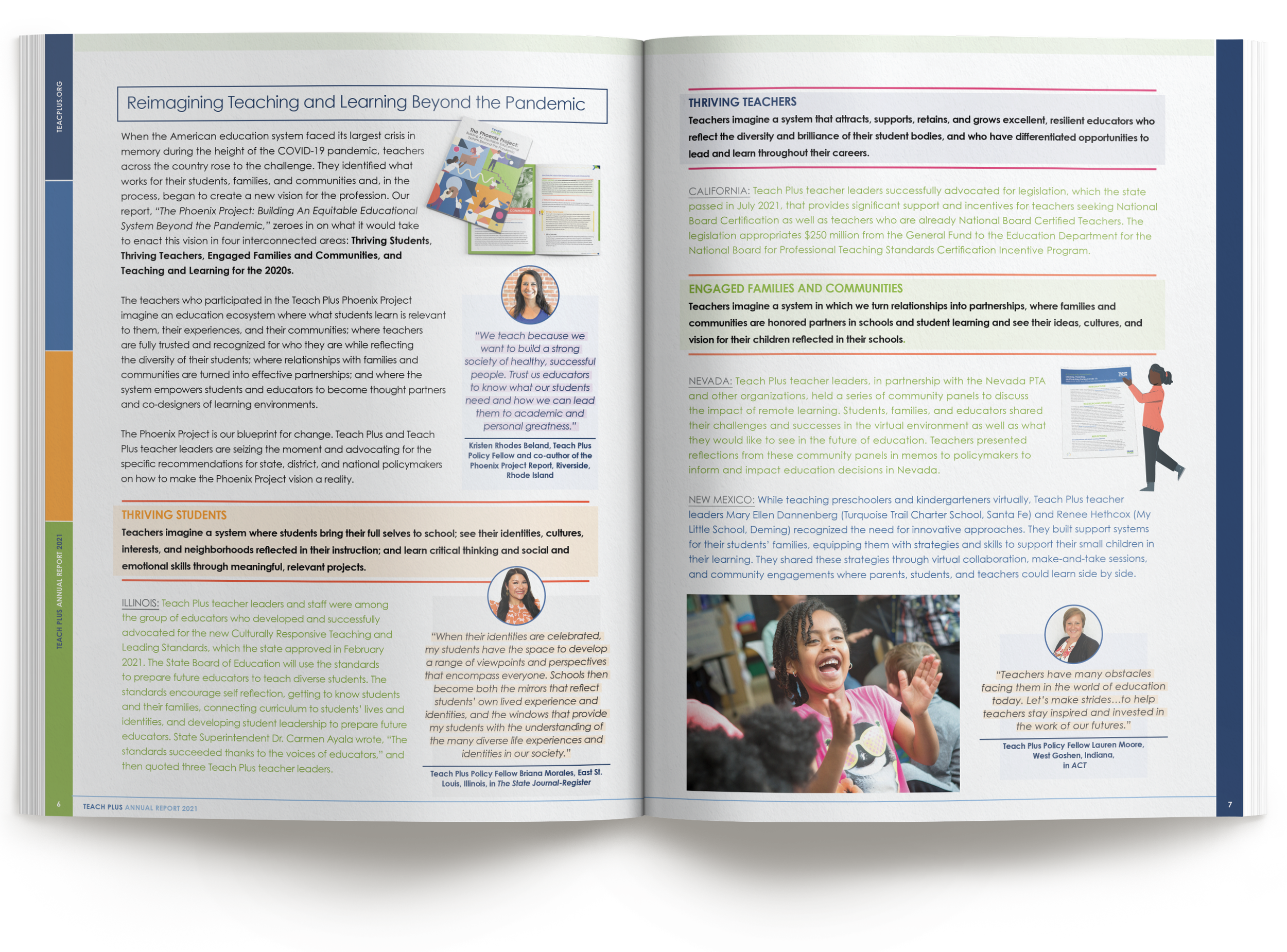
Brand as wayfinding. Color-blocked section bands give each policy area its own chapter, so a donor can find the program they fund without reading front to back.
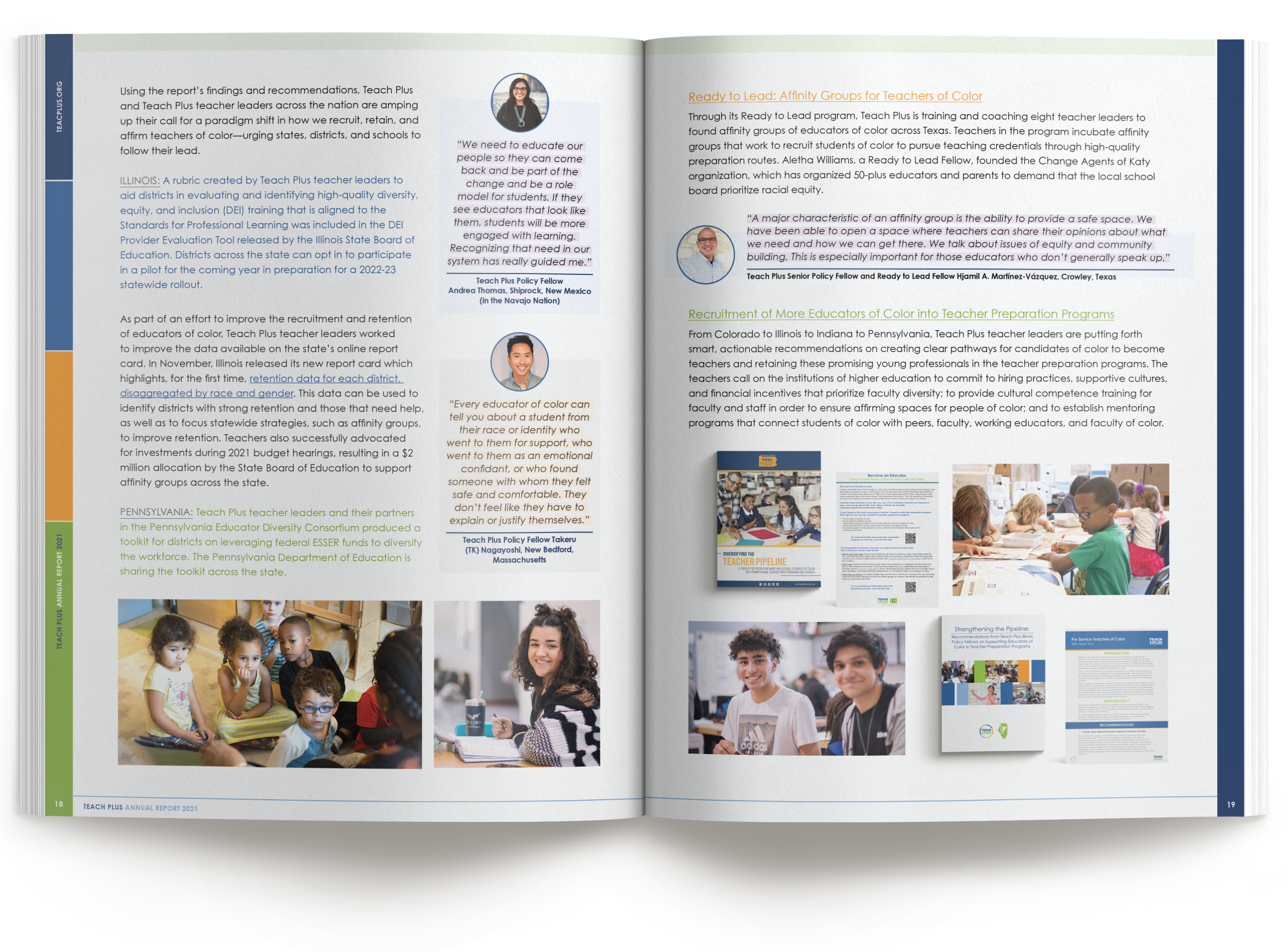
The work, not just the story. The year's published reports and briefs sit right in the spread, so donors see what their support produced.
Process note: Printed reports are built in multiples of four pages, so page count is a cost decision, not just an editorial one. Planning the full- and half-page photography from the first sketch locked the count early. The printer quoted once, and seven rounds of copy edits later, neither the pagination nor the quote had moved.
How We Work With Communications Teams
Most engagements begin with a manuscript: Word files, statistics, photo folders, and a brand guide. We build the design system around your content's structure, turn your data into publication-quality graphics in your brand, and manage edits through clearly versioned rounds so nothing gets lost between drafts. Twenty years in the print industry and thousands of pieces sent to press stand behind every job. We speak your printer's language, spec the job so it prints the way it was designed, and manage estimates, proofs, and press checks through delivery, holding costs on budgets large and small. Fixed launch dates are treated as fixed.
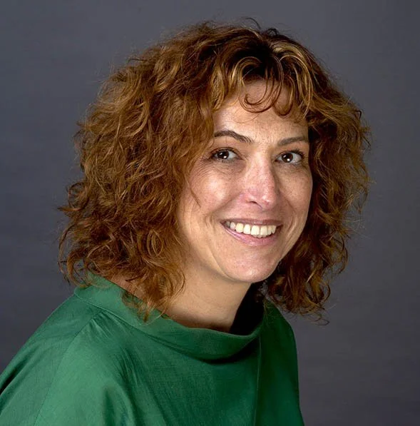
“We’ve worked with Karen on multiple large-scale design projects such as annual reports and national research reports. In every instance, Karen has kicked off the work with strong conceptual presentations that demonstrated her deep understanding of our field and of our thought leadership goals when it comes to design. Karen then remained flexible and open to feedback throughout the entirety of the design and editing process, making it easy for us to coordinate changes and improvements. We especially appreciate how fast Karen works and her close attention to detail to ensure copy accuracy throughout multiple rounds of edits. Our entire team knows and trusts Karen to deliver on-brand work that elevates our visual presence among our partners, influencers, and other key audiences.”
Planning a report like this?
Thirty minutes, no obligations. We'll talk about scope, timeline, and what your content needs to land.