
CASE STUDY / EDITORIAL DESIGN
Art-Directing a Weekly to Its Deadline
WEEKLY POLITICAL MAGAZINE • EDITORIAL • COVER + FEATURE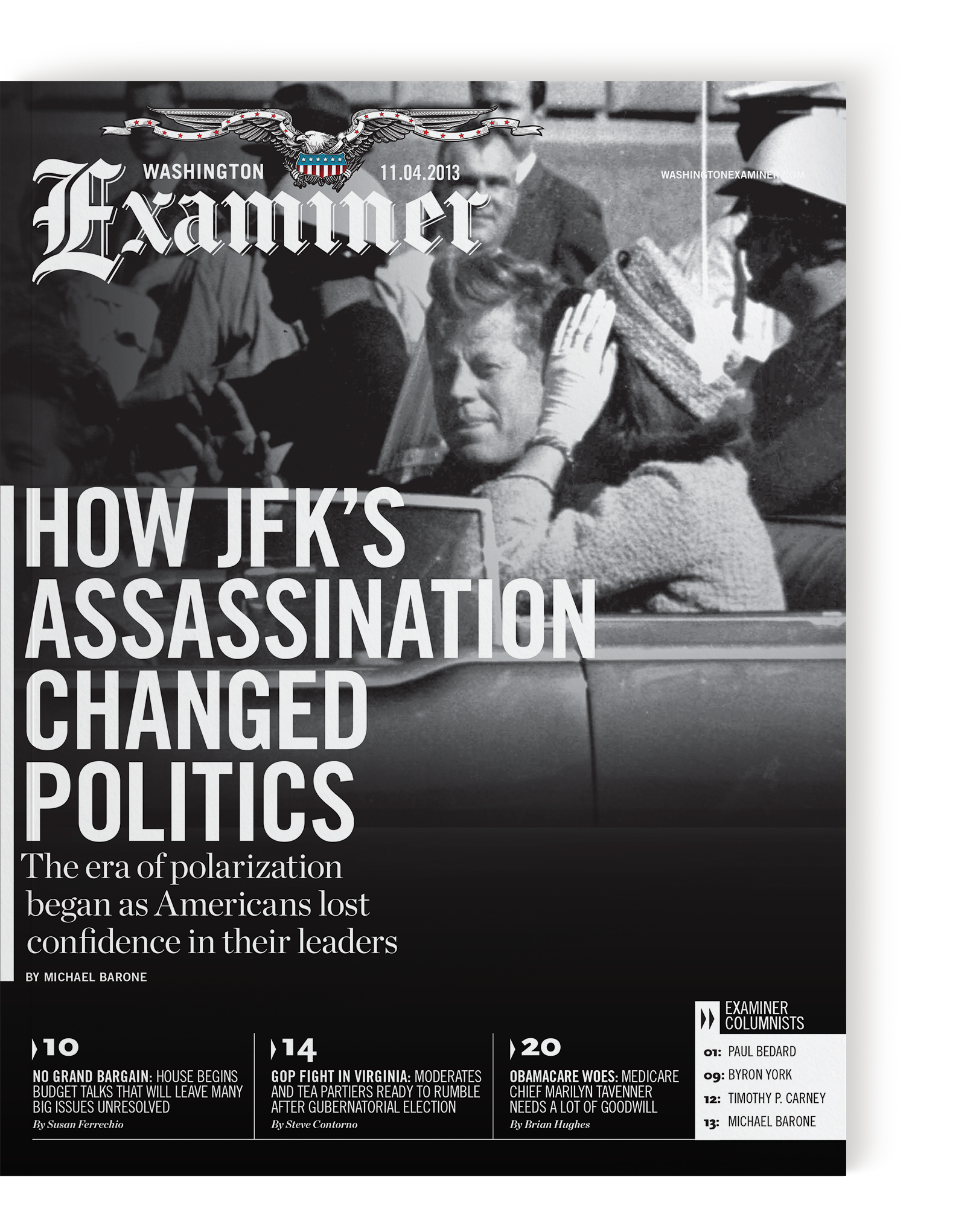
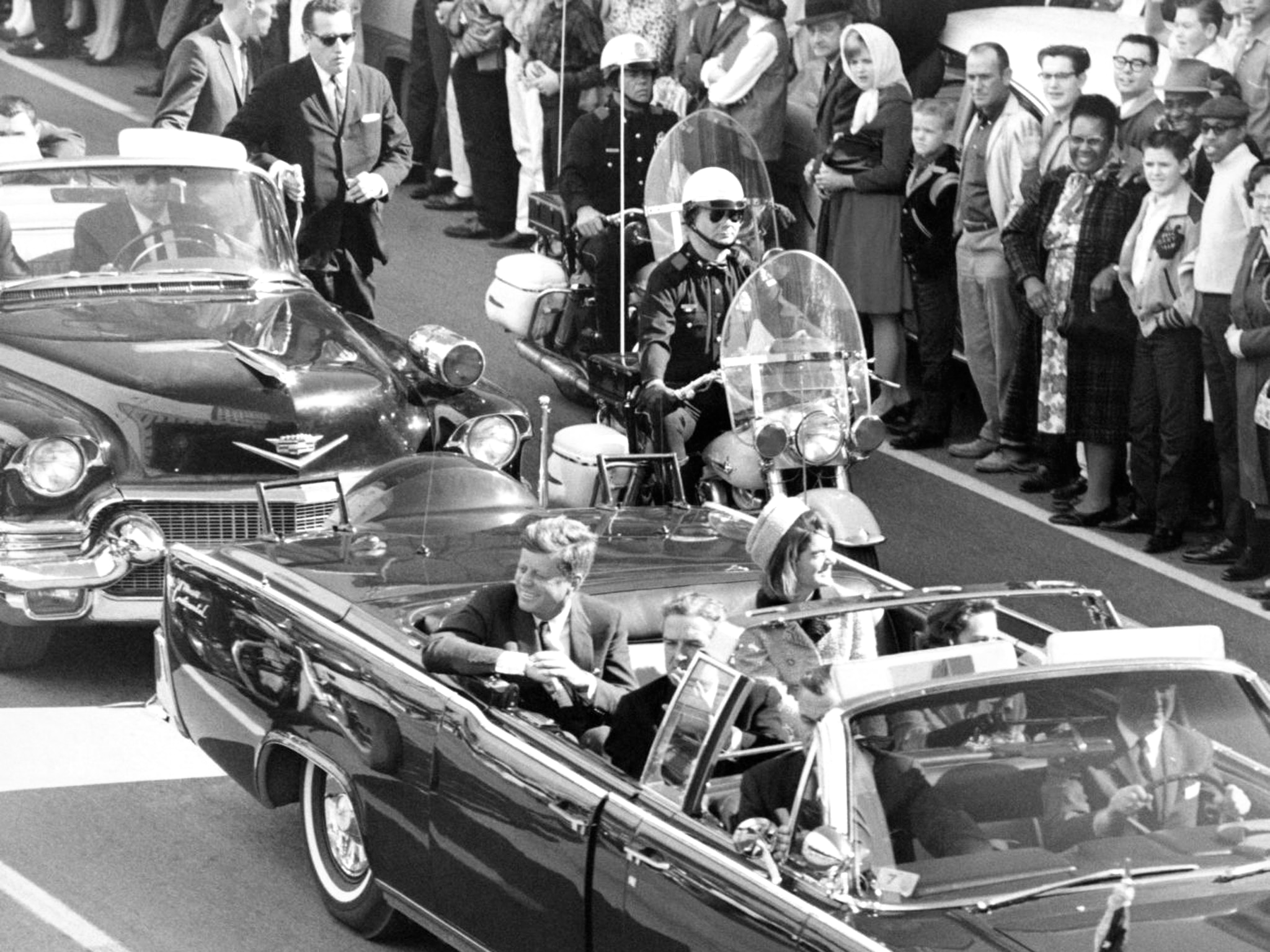
The cover. A black-and-white photograph of that day in Dallas, restraint on the cover so the fracture concept can open hard inside.
THE PROBLEM
A prominent weekly political magazine was running a cover story on how the 1963 Kennedy assassination shaped the nation's lasting divisions. As the art director building the full issue that week, I took the cover myself, because fast conceptual work is the strength this schedule rewards. The design had to carry both the divisions and the gravity of the event, on a 48-hour turnaround with no room on the deadline and no second round of review.
THE APPROACH
The image arrived the moment the editor described the premise: a single event in Dallas radiating fracture across the country, reducing a nation to red and blue. I designed the cover and carried that language of fracture through the whole package, into the headline typography, the callout boxes, and a custom numeral treatment for the table of contents. Reader comprehension was the test: one look, and you feel the article's argument before you read a word.
THE OUTCOME
The full issue shipped on the weekly deadline, roughly forty pages art-directed and sent to press ourselves before the 8:00 a.m. cutoff that decides whether a weekly prints at all. The cover concept held from first sketch to press, built and closed inside two days without a second concept in reserve.
Whole Issue
ROUGHLY 40 PAGES ART-DIRECTED AND SENT TO PRESS EACH WEEK
48 Hours
CONCEPT TO PRESS-READY, THE WEEKLY'S ONLY OFFER
Before 8 A.M.
THE PRESS CUTOFF THAT DECIDES WHETHER A WEEKLY PRINTS AT ALL
Cover to TOC
ONE FRACTURE CONCEPT CARRIED THROUGH TYPE, CALLOUTS, AND THE TOC
Scope also included: cover design, interior layout, concept development, creative direction, and photo editing.
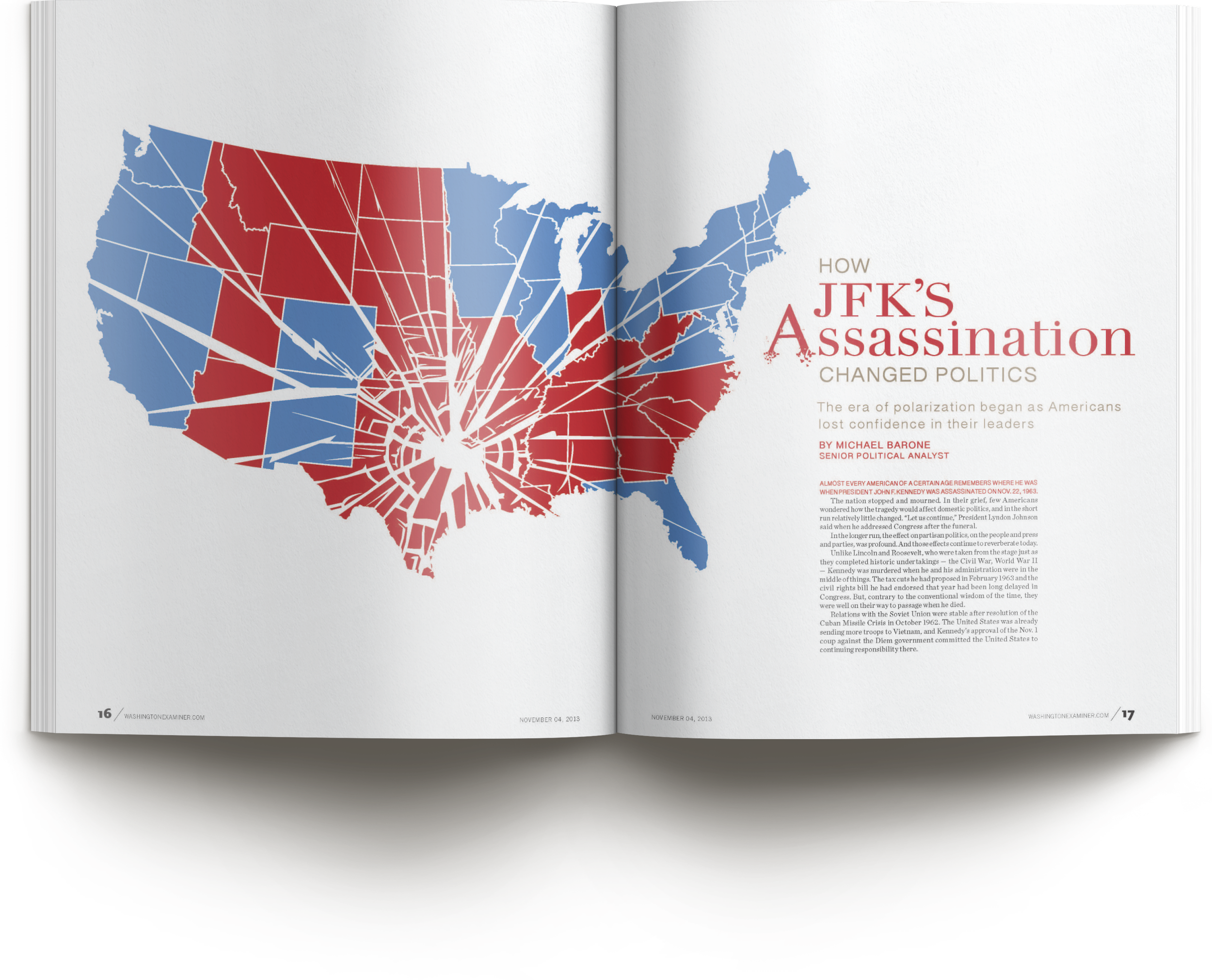
The opening spread. The red and blue map shattered by the event, the article's thesis made into one image a reader takes in before a word.
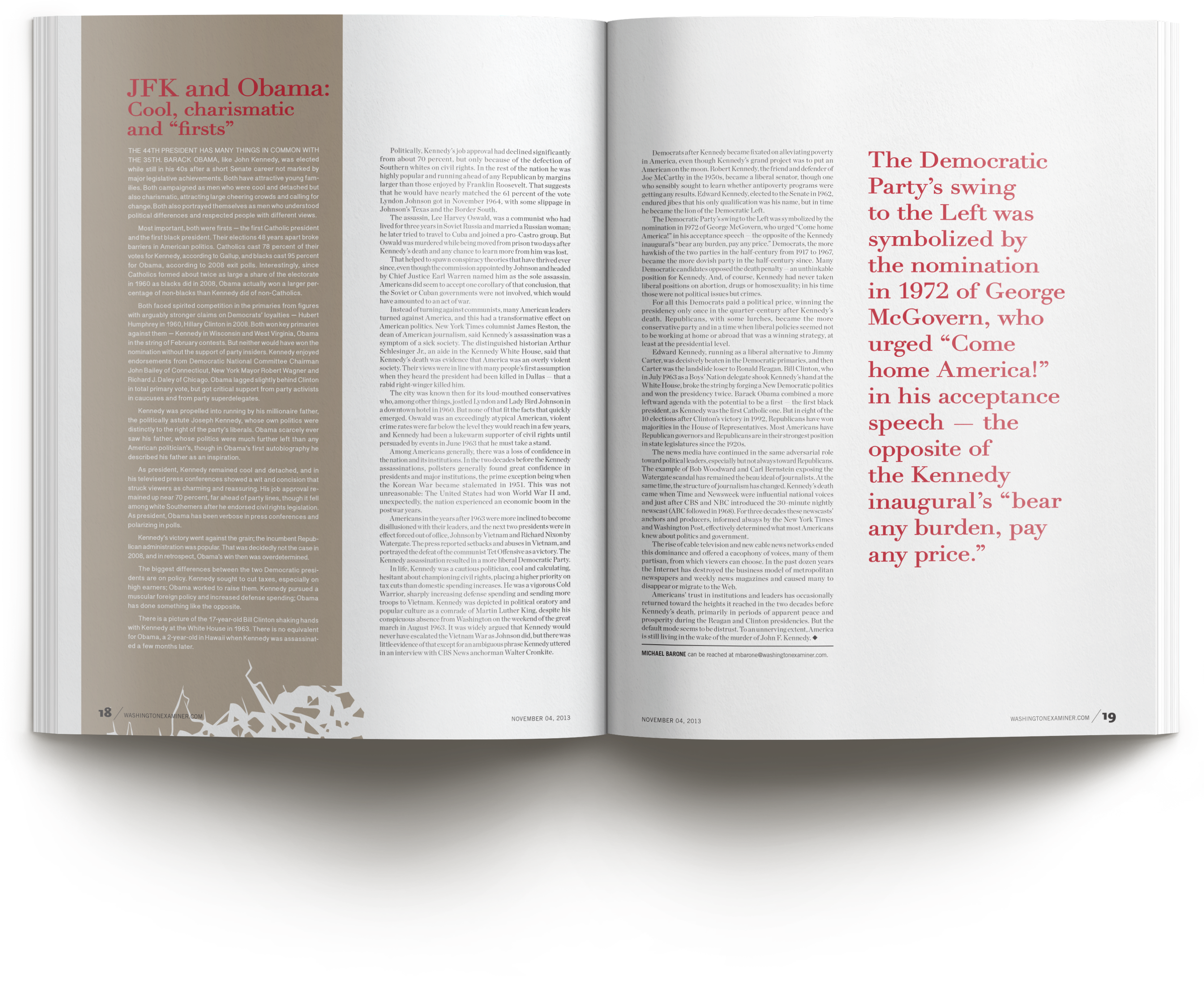
The feature spread. The same colors and fracture carried through, with a large pull quote as a focal point that brings drama and breathing room to a dense read.
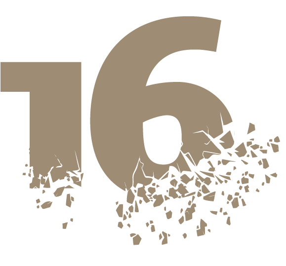
The TOC numeral. A custom shattered number for the table of contents, because a concept that stops at the layout is a concept half-finished.
Process note: Weeklies teach a discipline no other schedule does. You think fast, work efficiently, and solve the concept without the luxury of playing around with a design until it feels right. That pressure builds strong conceptual muscles, and this feature design is one of them: delivered without a crisis because twenty years of print deadlines are behind it.
How We Work With Editors and Publications
Print publications run on hard dates, and we design accordingly. Give us the headline, the manuscript length, and whatever art you have, and we will bring back a cover and layout concept that serves the story, not just the page. Missing art is no obstacle: a photography background means we can shoot, illustrate, or source what the story needs. Two decades of editorial design, an eye trained first in photography, and thousands of pieces sent to press mean we can carry a concept from cover to folio under deadline pressure without cutting corners on craft. When the issue closes, it closes with the design intact.
Planning editorial pages?
Thirty minutes, no obligations. We'll talk about your publication, your deadline, and what the story needs from its design.