

CASE STUDY / DIRECT MAIL + COLLATERAL
Leading With a Question, Not a Pitch
NACD • MEMBERSHIP MAILER • FOLDER + EXECUTIVE SUMMARY • PRINT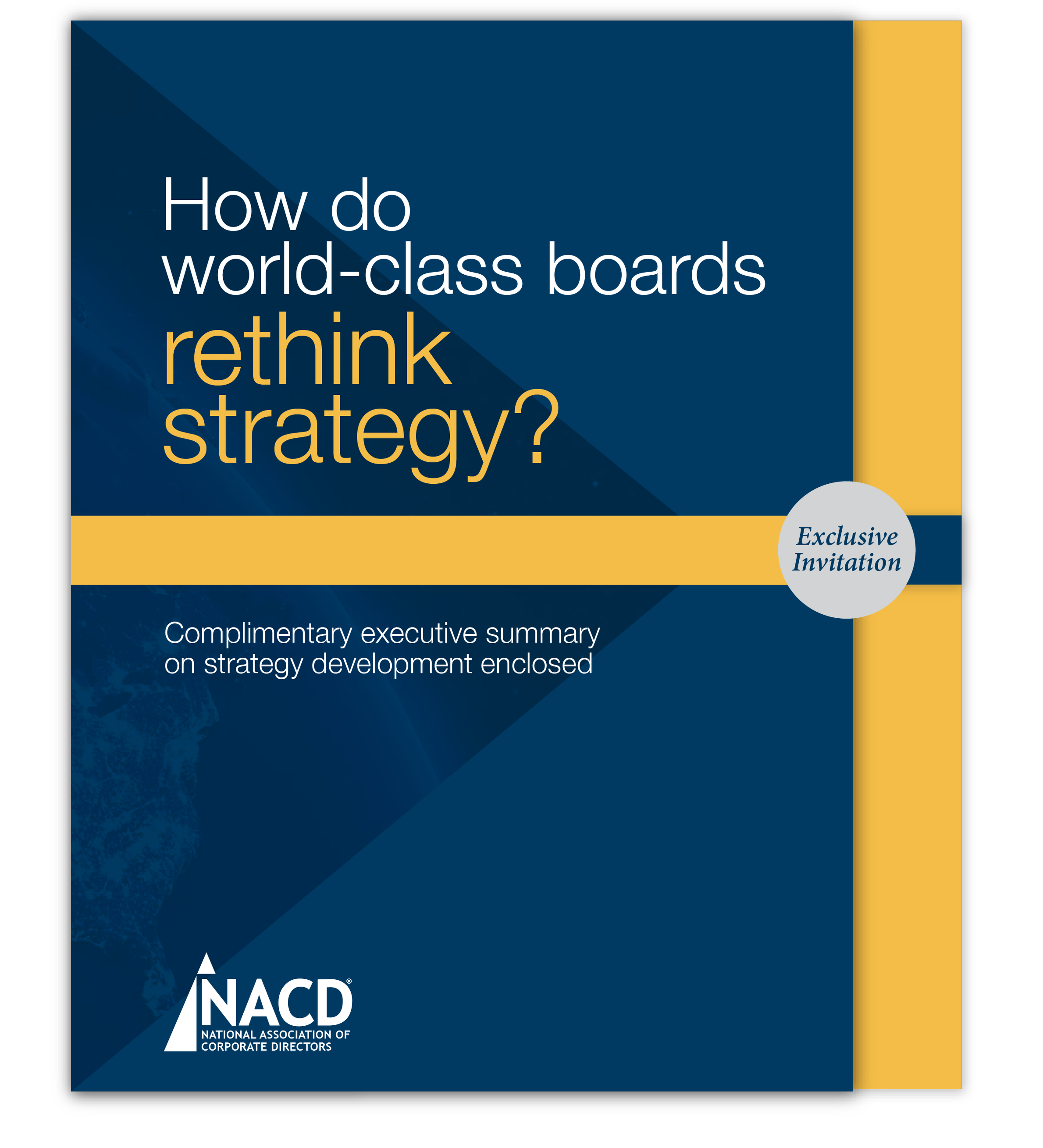
The cover. A governance question a sitting director is already weighing, with the offer held below the fold.
NACD is the professional association for corporate board directors, and nearly everything it sells sits behind membership: commission reports, benchmarking, handbooks. That creates a hard sales problem. A director being asked to join has no way to judge the quality of the research until after they've joined, and they receive more unsolicited mail than almost any audience in American business, much of it screened before it reaches the desk. The piece had to make the case for the research without asking anyone to take it on faith.
THE PROBLEM
We opened with a question rather than an offer: how do world-class boards rethink strategy? It speaks to the reader's judgment rather than their title, and it names something a sitting director is already weighing. Inside, the argument builds in three moves: a short checkbox rationale on the left panel, an angled die-cut pocket on the right, and inside that pocket the actual Blue Ribbon Commission executive summary, produced to the same standard as the research NACD sells. A director doesn't have to take the association's word for the value of membership, because a sample of it is in their hands. The booklet carries the association's navy and gold, earth and city photography at full bleed, and pull quotes from directors at companies the reader knows.
THE APPROACH
A membership mailer engineered for its audience and for the mail stream: die-cut, bulk-mail compliant, and impossible to mistake for another envelope on the desk. Inside, a complimentary executive summary gave prospective members a sample of the strategy-development guidance available through NACD membership, the same "rethink strategy" idea carried on the cover.
THE OUTCOME
Hand-Built First
PAPER-AND-SCISSORS MOCKUPS BEFORE ILLUSTRATOR EVEN OPENED
CUT TO HOLD THE BOOKLET SNUG AND SHAPE HOW THE PIECE OPENS
Die-Cut Pocket
SIZED TO NONPROFIT BULK-MAIL REQUIREMENTS WITHOUT GIVING UP THE DIE-CUT
Bulk-Mail Ready
Clear Envelopes
THE DESIGN STARTS SELLING BEFORE THE PIECE IS OPENED
Scope also included: folder design, die-line development, executive summary cover and interior layout, photo research, and print production.
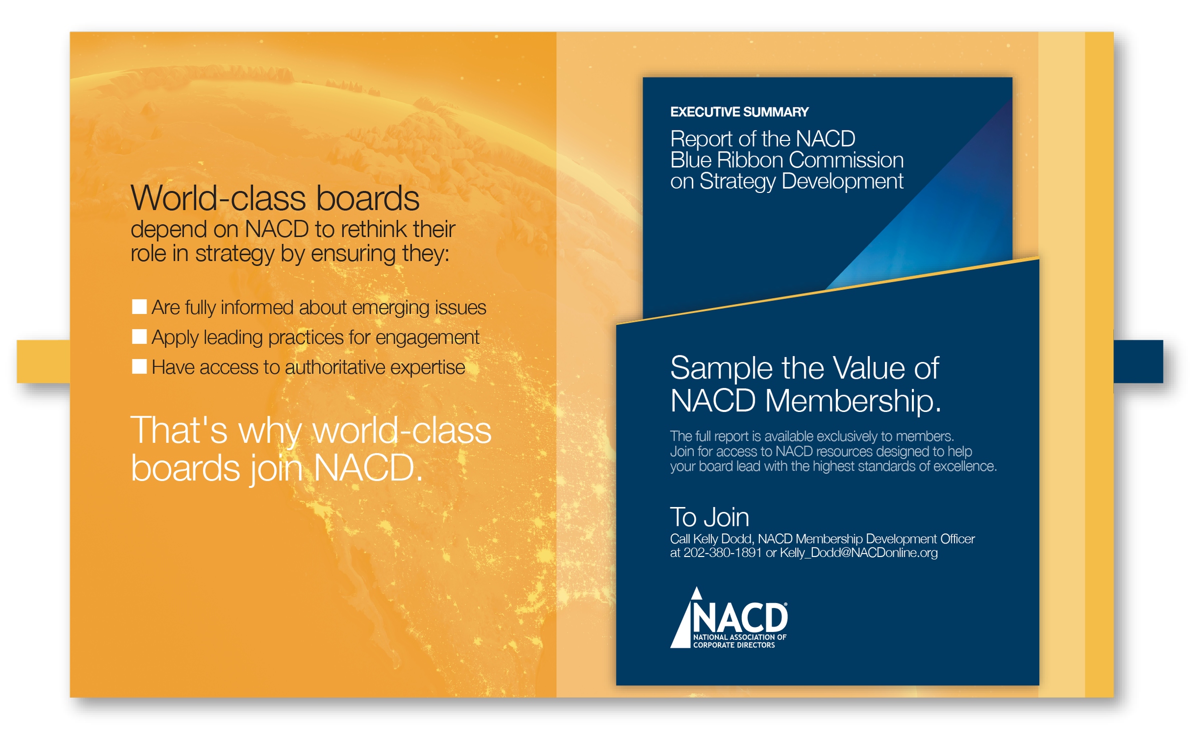
The reveal. The angled pocket holds the executive summary. Membership isn't described here, it's demonstrated: the reader gets a piece of the research the association sells.
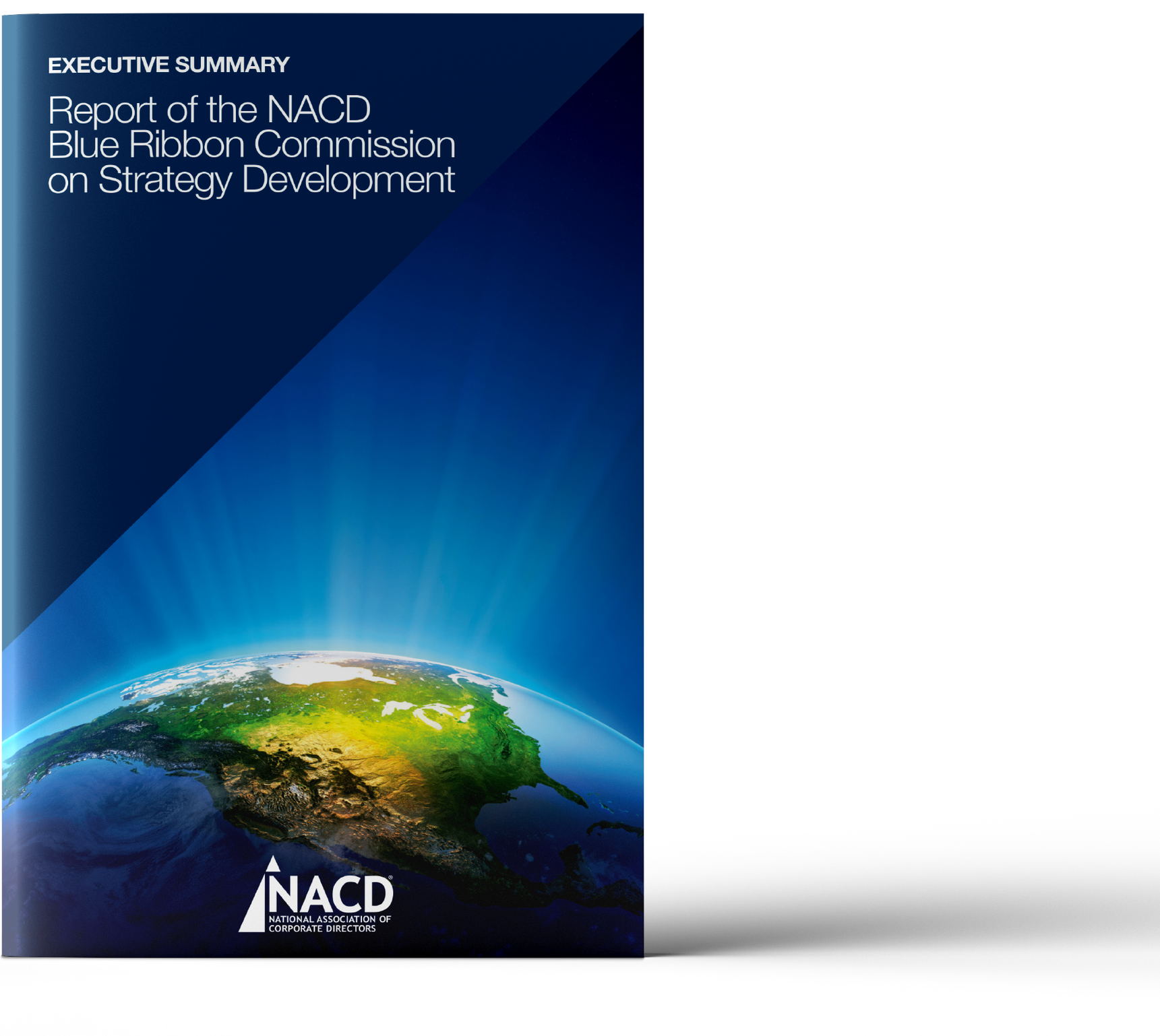
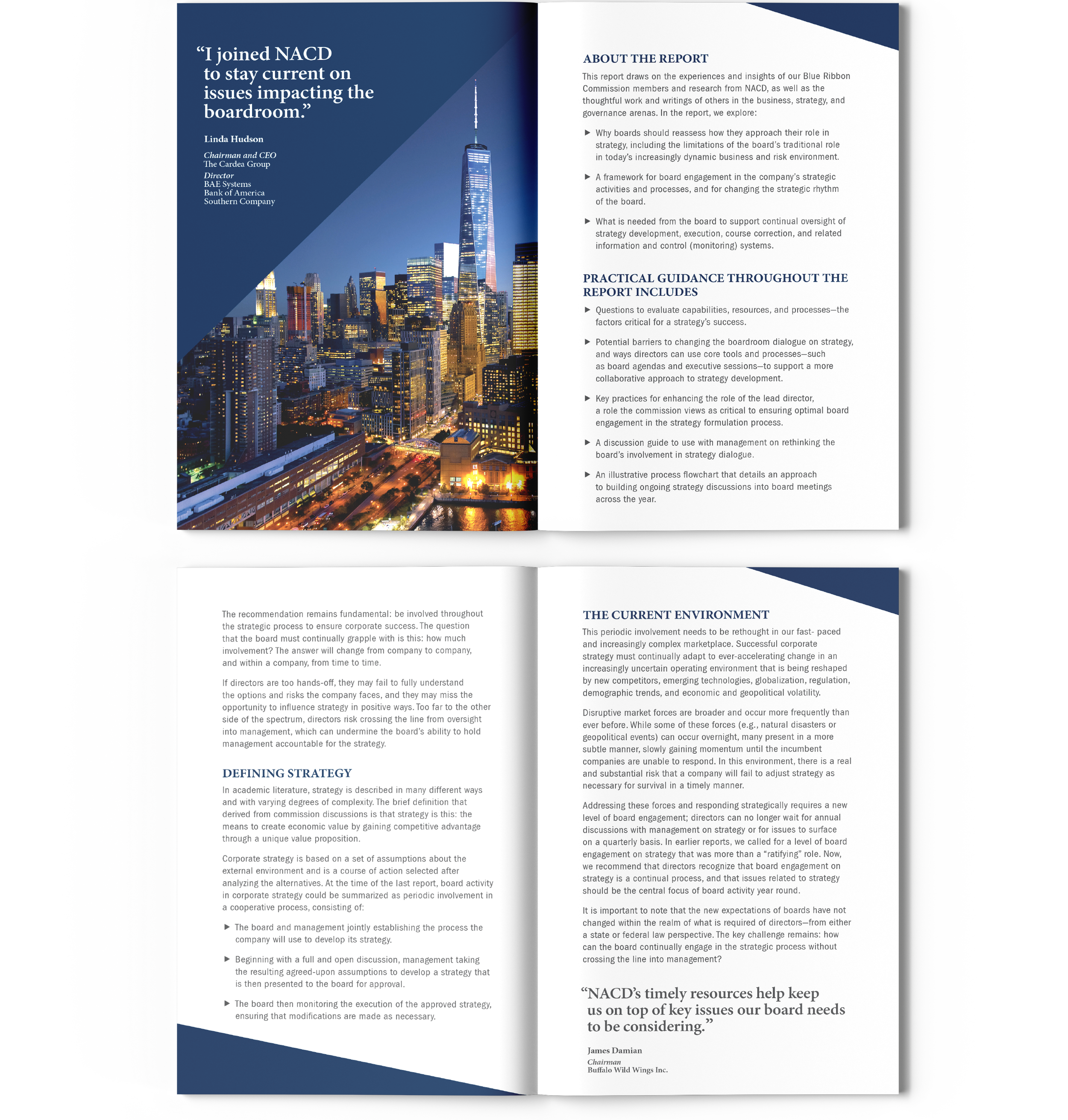
The booklet. Produced at the standard of NACD's own commission reports, with pull quotes from sitting directors carrying the argument for scanning readers.
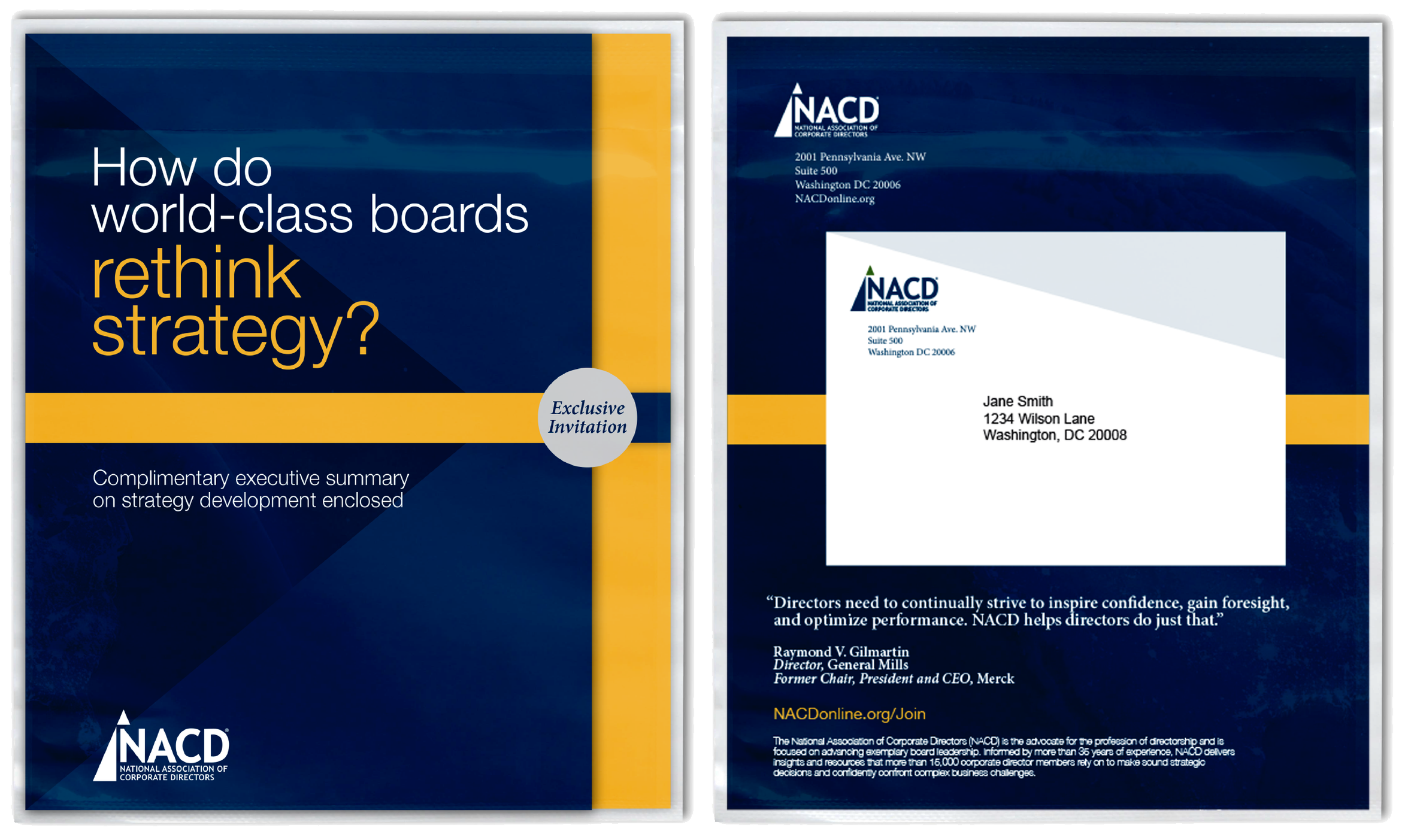
The envelope. Clear stock, so the design starts working before anything is opened.
Process Note: Direct mail is a physical product with dimensions set by postal regulation, and the difference between a beautiful comp and a mailable piece is measured in fractions of an inch. We built the folder by hand first, then checked the rendered die lines against the postal template, so the die-cut concept survived contact with bulk-mail requirements instead of dying in production.
How We Work With Communications Teams
Most engagements begin with a manuscript: Word files, statistics, photo folders, and a brand guide. We build the design system around your content's structure, turn your data into publication-quality graphics in your brand, and manage edits through clearly versioned rounds so nothing gets lost between drafts. Twenty years in the print industry and thousands of pieces sent to press stand behind every job. We speak your printer's language, spec the job so it prints the way it was designed, and manage estimates, proofs, and press checks through delivery, holding costs on budgets large and small. Fixed launch dates are treated as fixed.
Planning a piece that has to get opened?
Thirty minutes, no obligations. We'll talk about scope, timeline, and what your piece needs to do.