

CASE STUDY / PRINT COLLATERAL DESIGN
Engineering One Folder for Every Funder Meeting
EDTRUST • PRESENTATION FOLDER • PRINT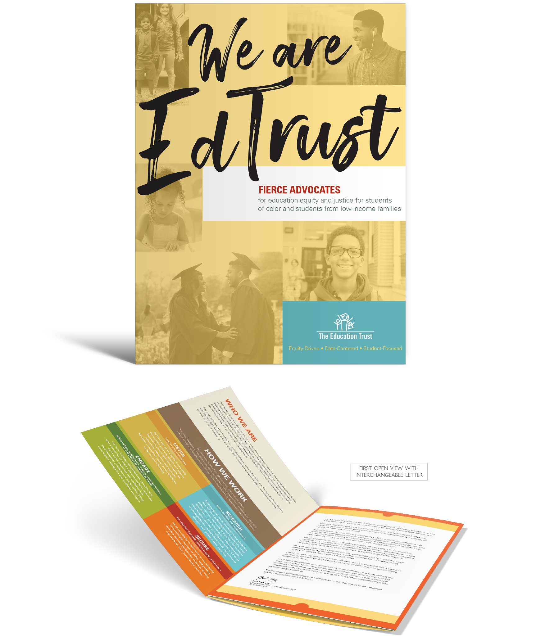
The folder. Neutral-but-dynamic brand shades letting photography and typography lead, engineered to feel substantial in a funder's hands.
THE PROBLEM
EdTrust came to me with one sentence: "We need something to bring to funder meetings." A national nonprofit competing for high-profile donor attention needed its many information pieces consolidated into a single presentation: professional, energetic, respectful of the people receiving it, and workable for multiple departments across offices nationwide.
THE APPROACH
I designed to the brief, then designed past it. Alongside the requested concept, I proposed a multi-purpose die-cut folder that customizes to each user's needs, saves on print costs, and holds brand consistency across the organization. Die-cut sections hold inserts, booklets, and letters that can be printed in-house for quick, efficient use of resources. From the client's wide brand palette, I chose the more neutral yet dynamic shades so photography and modern typography lead. I worked closely with in-house copy editors and with print partners on paper stock samples, quotes, and press checks so the finished piece rendered exactly as designed.
THE OUTCOME
I turned a stack of separate fundraising materials into one adaptable system for high-stakes funder meetings: a single folder, filled to fit each conversation, carrying a consistent national brand across every office. Funders reacted to the piece in the room, and the printer who built it now shows it to his own prospective clients as a benchmark.
"Seriously, one by one, the foundation folks sat down, looked at the folder, and said "wow, this is gorgeous."
– Member of the Development Team
"The folder received major props for our collateral at the funder meeting!”
– Member of the Senior Leadership Team
1 Folder
CUSTOMIZABLE ACROSS DEPARTMENTS AND NATIONWIDE OFFICES
In-House Inserts
DIE-CUT SECTIONS SIZED FOR MATERIALS PRINTED ON DEMAND
30-Year Benchmark
A VETERAN PRINTER NOW SHOWS THIS FOLDER TO HIS OWN PROSPECTS
Funder Ready
ONE PIECE REPLACING A STACK OF LOOSE MATERIALS
Scope also included: print design, prepress, concept development, creative direction, print production management through press checks.
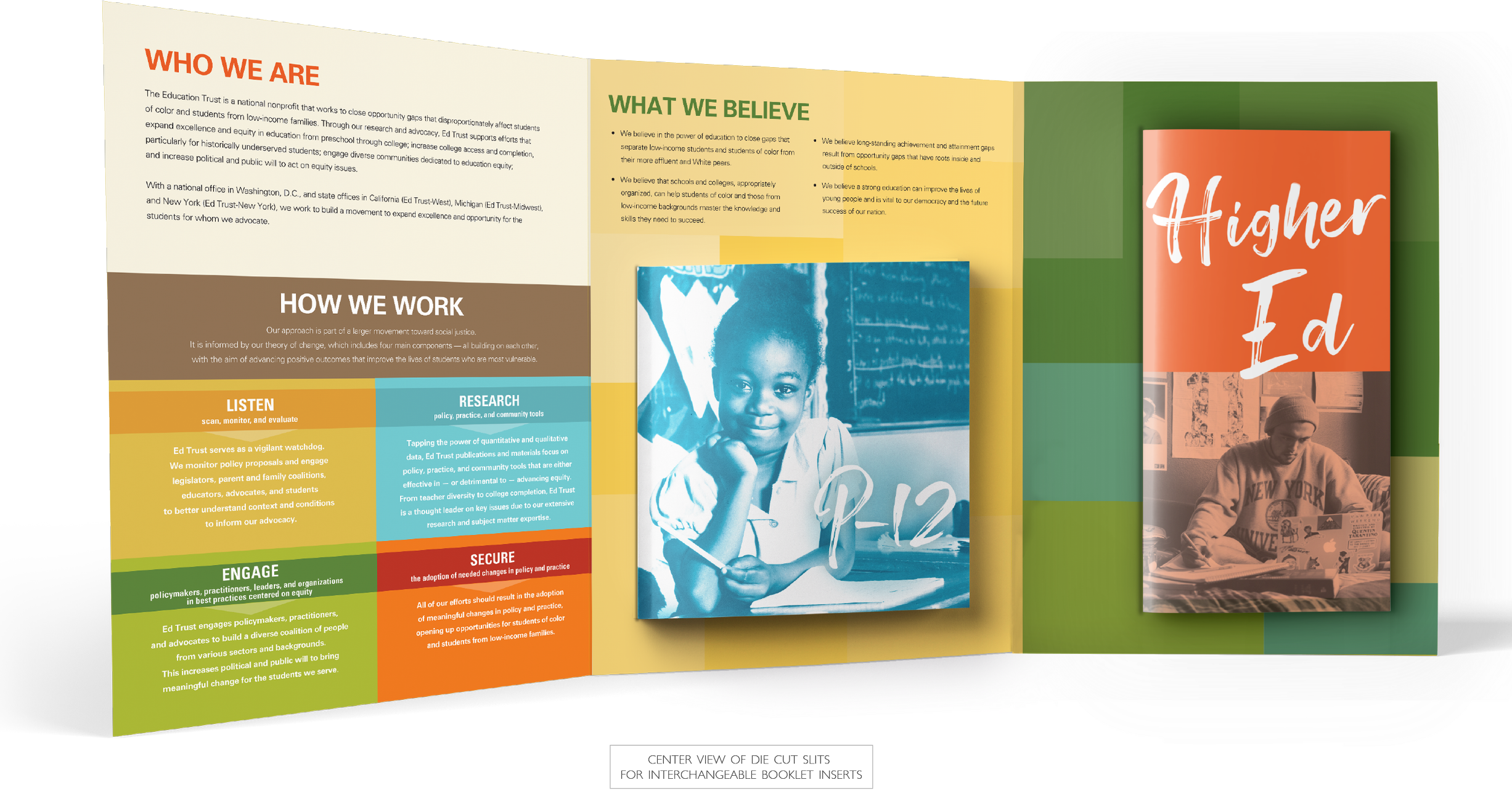
The folder, open. Die-cut sections presenting multiple brochures at once: the engineering the printer called one of the best he has seen.
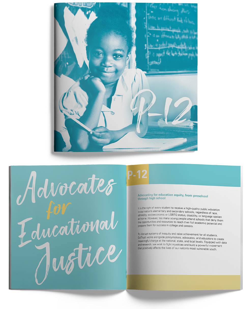
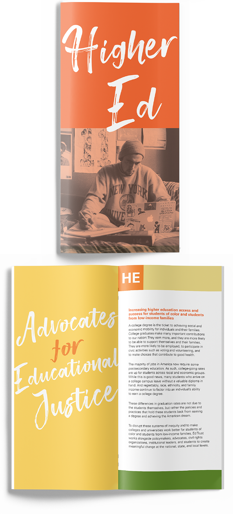
The insert system. Booklets and letters printed in-house, dropped into a folder that keeps every office on brand.
Process note: The folder's economics are the quiet win: die-cut once, professionally printed once, and then filled in-house forever. That is what it looks like when print production experience shapes the concept instead of arriving after it.
"I use the Ed Trust folder as an example of exceptional design and unique engineering of how multiple brochures could be displayed in a Corporate folder. Having been in the Printing and Graphics industry for over 30 years this Brand folder stands out as one of the best uses of color and design I have ever seen."
— Greg Hansen, VP of Sales, Mosaic Printing
How We Work With Communications Teams
Most engagements begin with a manuscript: Word files, statistics, photo folders, and a brand guide. We build the design system around your content's structure, turn your data into publication-quality graphics in your brand, and manage edits through clearly versioned rounds so nothing gets lost between drafts. On the production side, twenty years in the print industry and thousands of pieces sent to press stand behind every job. We speak your printer's language, spec the job so it prints the way it was designed, and manage estimates, proofs, and press checks through delivery, holding costs on budgets large and small. Fixed launch dates are treated as fixed.
Planning collateral that has to work harder?
Thirty minutes, no obligations. We'll talk about your audience, your budget, and what the piece needs to accomplish.