
CASE STUDY / EDITORIAL DESIGN
Putting an Invisible Problem on the Cover
AGU • EOS MAGAZINE • A MOUNTAIN OF MOLEHILLS • COVER + FEATUREDesigned while acting as art director for AGU.
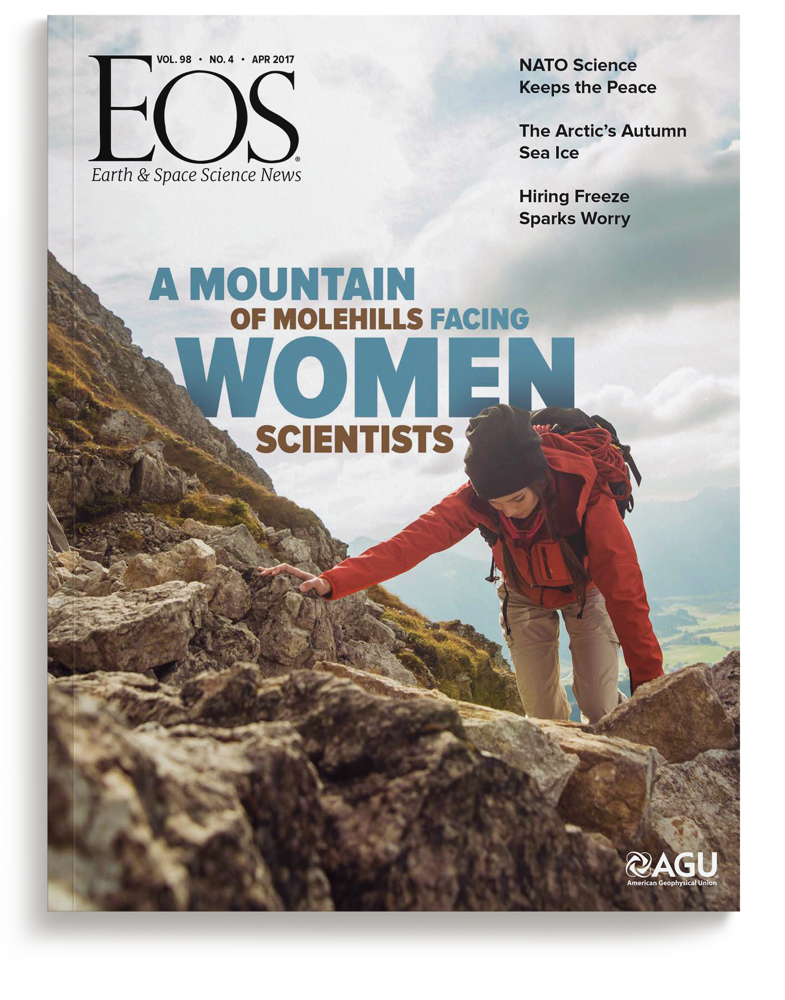
The cover. The headline set into the photograph, layered behind the mountain and the climber's pack, so the title is part of the image rather than a label on it.
THE PROBLEM
Eos, the science news magazine of the American Geophysical Union, was running a cover story on the career barriers women face in the earth and space sciences. We were handed the headline, the expected article length, and a handful of images. Everything else, cover concept through feature layout, was ours to develop against a hard print date.
THE APPROACH
The headline's "mountain of molehills" was our cue. We chose a cover image with room for the type to sit within the scene, then layered it behind the mountain and the climber's backpack to tie the headline to the subject matter. For the feature, we selected two images of women literally climbing and used the red-orange of a climber's backpack as the accent color throughout the layout. On the opening spread, both the background and the text columns angle upward to echo the climb, and one word, "Illuminate," is set in yellow to do exactly that.
THE OUTCOME
The concept gave a serious subject an immediate way in: the argument lands before the magazine is opened. The online feature became one of Eos's most-read stories of 2017, ranking third among all articles that year with 19,471 pageviews. The April 2017 issue won a Silver EXCEL Award from Association Media & Publishing for cover photography, the recognition association publishers give for excellence in nonprofit media and communications. The winning cover is the one built here: the image selected for the story, and the headline layered into it so type and photograph read as one. Produced for AGU's community of more than 60,000 earth and space science professionals, the story kept circulating well past its issue, later cited in academic research and gathered into university and professional resources on gender equity in science.
Silver EXCEL Award
FOR THE APRIL 2017 COVER PHOTOGRAPHY#3 Story of 2017
Type in the Scene
HEADLINE LAYERED INTO THE PHOTOGRAPH, NOT SET ON TOP OF
1 Color Cue
RED-ORANGE PULLED FROM A CLIMBER'S PACK, CARRIED THROUGH THE FEATURE
Scope also included: cover design, interior feature layout, concept development, creative direction, and photo editing.
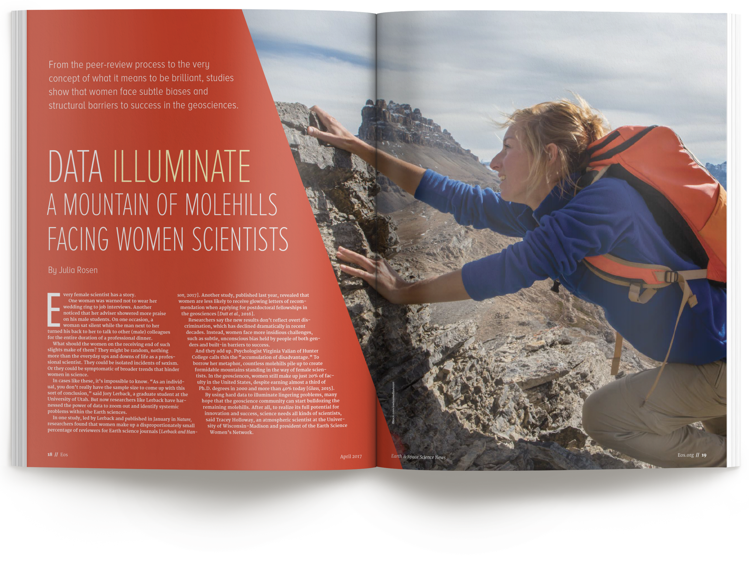
The opening spread. Slanted background, slanted columns, and one climber's red-orange pack setting the palette: the mountain analogy carried into the typography itself.
Process note: A headline, a length, and a handful of images is often all an editor can hand over, and it's enough. The work is turning that into a concept a reader understands before they read: here, a mountain built from a title, an accent color lifted from inside the photograph, and a layout that leans like the climb it describes.
How We Work With Editors and Publications
Print publications run on hard dates, and we design accordingly. Give us the headline, the manuscript length, and whatever art you have, and we bring back a cover and layout concept that serves the story, not just the page. And if the art doesn't exist yet, that's not a blocker: we research it, source it, or create it, from photo curation to original photography and illustration. Behind every layout is two decades of editorial design, an eye trained in photography, and thousands of pieces sent to press, so a concept carries from cover to folio under deadline pressure without cutting corners on craft. When the issue closes, it closes with the design intact.
Planning a cover story?
Thirty minutes, no obligations. We'll talk about your publication, your deadline, and what the story needs from its design.