

CASE STUDY / LOGO DESIGN
One Child, Every Child: Logo Design for a New Nutrition Coalition
CHILD AND STUDENT NUTRITION ALLIANCE • LOGO DESIGN • BRANDThe Child and Student Nutrition Alliance, a newly formed coalition of nonprofits advocating for robust federal investment in child nutrition, needed its first logo. There was no existing brand, no visual direction, and a multi-organization approval process. The only brief was the mission itself.
THE PROBLEM
THE APPROACH
The logo is an illustrated figure of a schoolchild, deliberately nonspecific in race and gender, representing every student, posed in motion, moving forward as if excited for school. The backpack is shaped to read as an apple, carrying the nutrition theme without a word. Green leads the palette because it says healthy food and vibrant energy; purple, its complement, makes both colors more vivid. I held the system to two colors so the coalition's printed collateral stays affordable, and delivered black-and-white secondary versions for single-color use.
THE OUTCOME
A complete, ready-to-use identity for a coalition launching its advocacy work, approved across multiple member organizations.
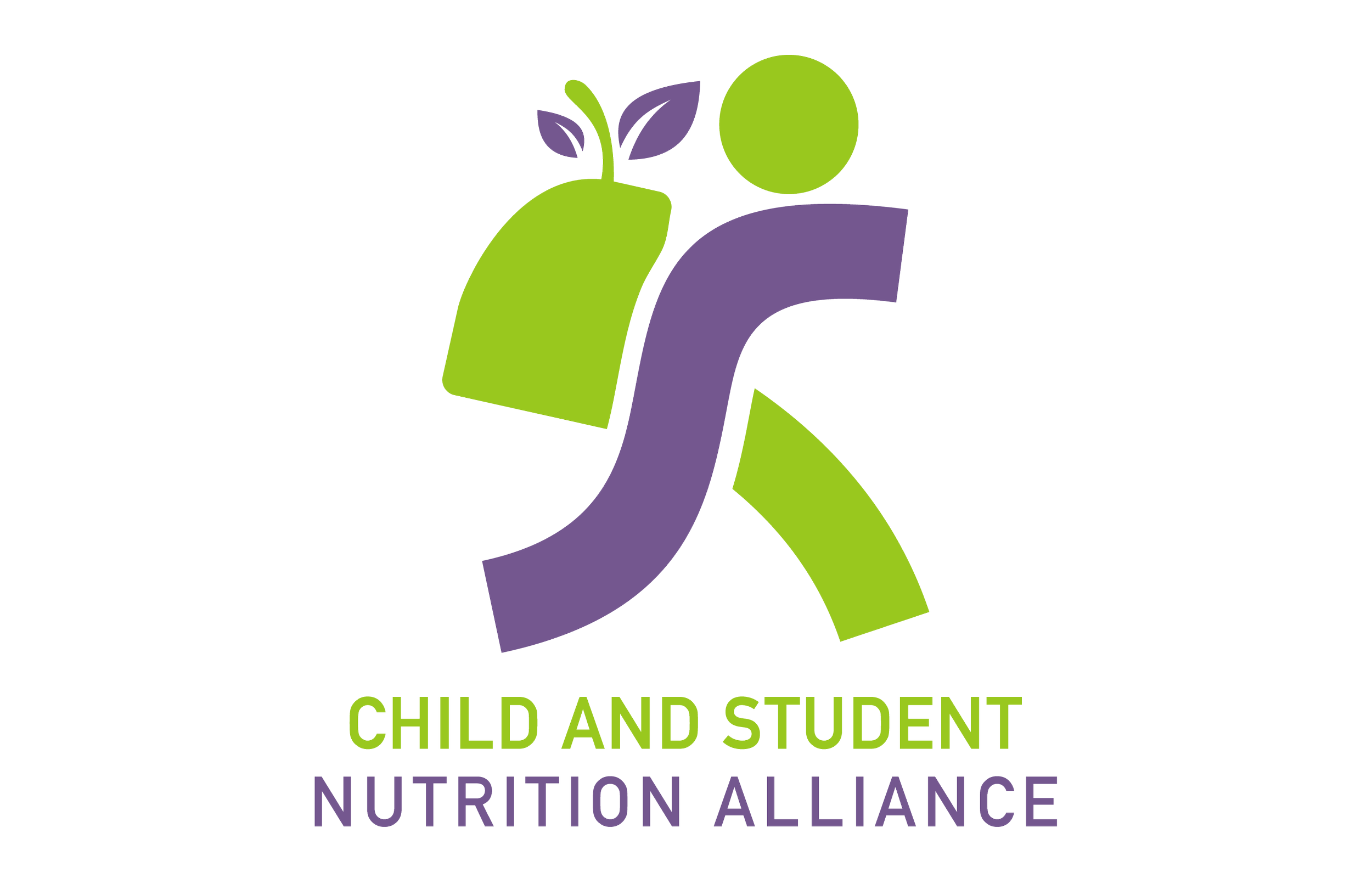
The primary mark. A schoolchild in motion, drawn to represent every student, with a backpack that doubles as an apple.
1 illustration
DRAWN NONSPECIFIC TO RACE AND GENDER, SO EVERY STUDENT IS IN IT
2 Colors
GREEN AND PURPLE, CHOSEN SO NONPROFIT PRINTING STAYS AFFORDABLE
Blank Slate
NO VISUAL DIRECTION PROVIDED, ONLY THE MISSION
Full Family
BLACK-AND-WHITE SECONDARIES DELIVERED FOR SINGLE-COLOR USE
Scope also included: secondary logos, concept development, and creative direction through a multi-organization approval process.
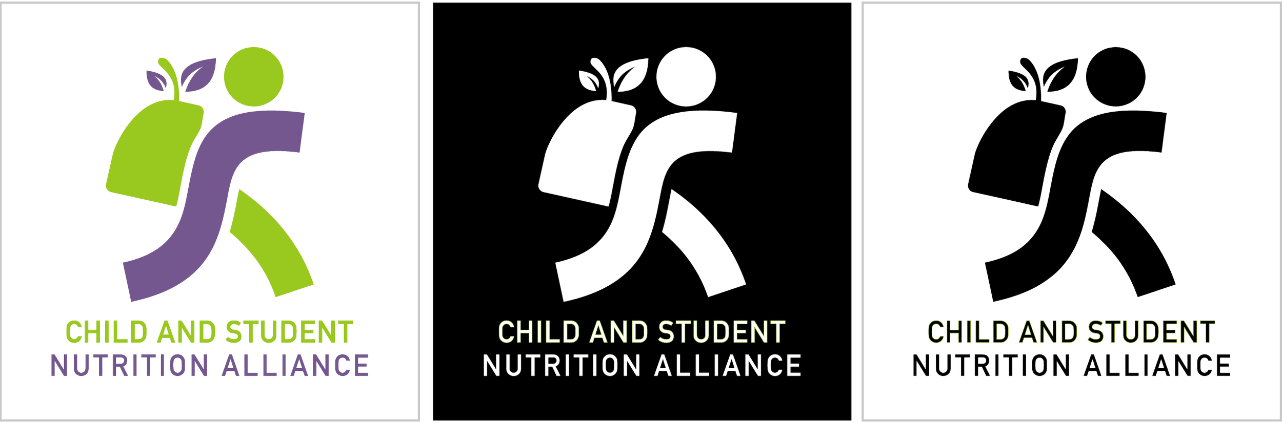
Secondary logo designs. One- and two-color variations that hold up on everything from letterhead to event signage.
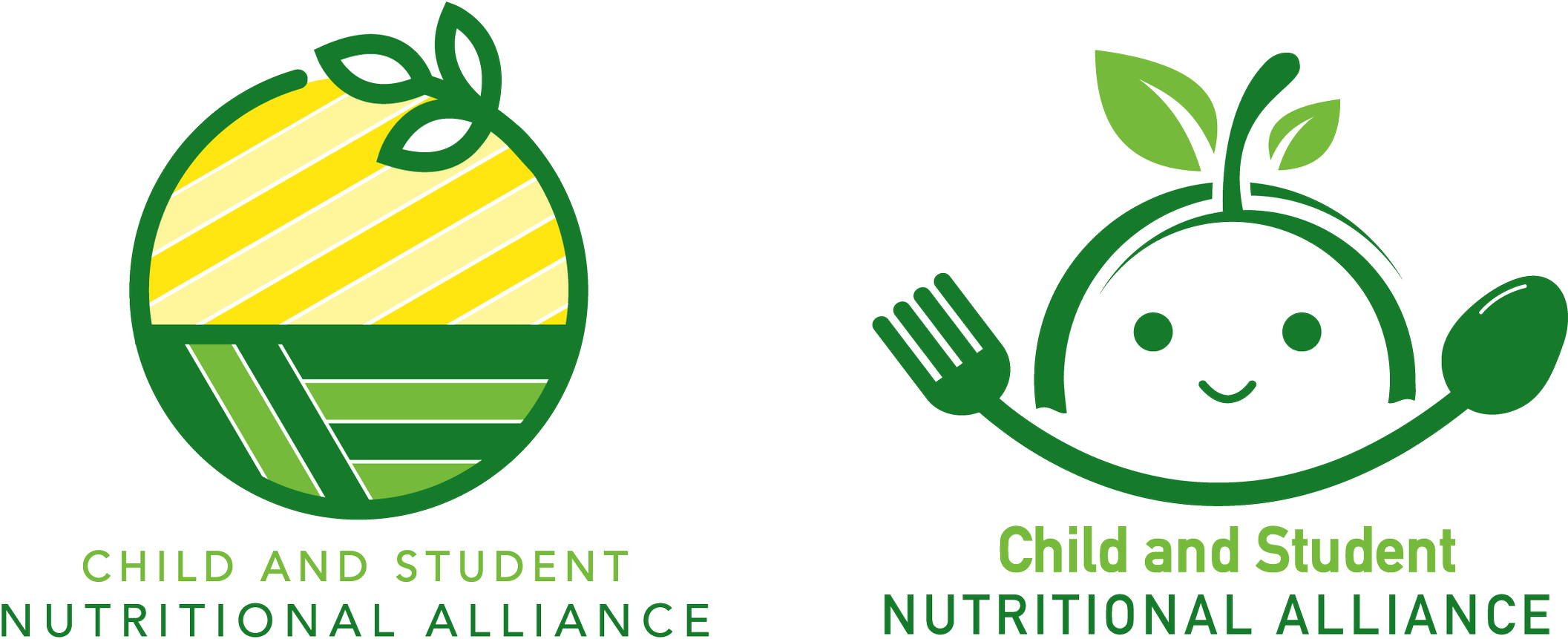
Additional concepts submitted. Developed directions, not sketches, so the coalition could choose with confidence.
A two-color palette is a discipline, not a limitation. For a coalition that will print invitations, signage, and collateral on nonprofit budgets for years, every color beyond the second adds cost to every piece. The palette was chosen to say health and energy, and to keep the printing bill saying yes.
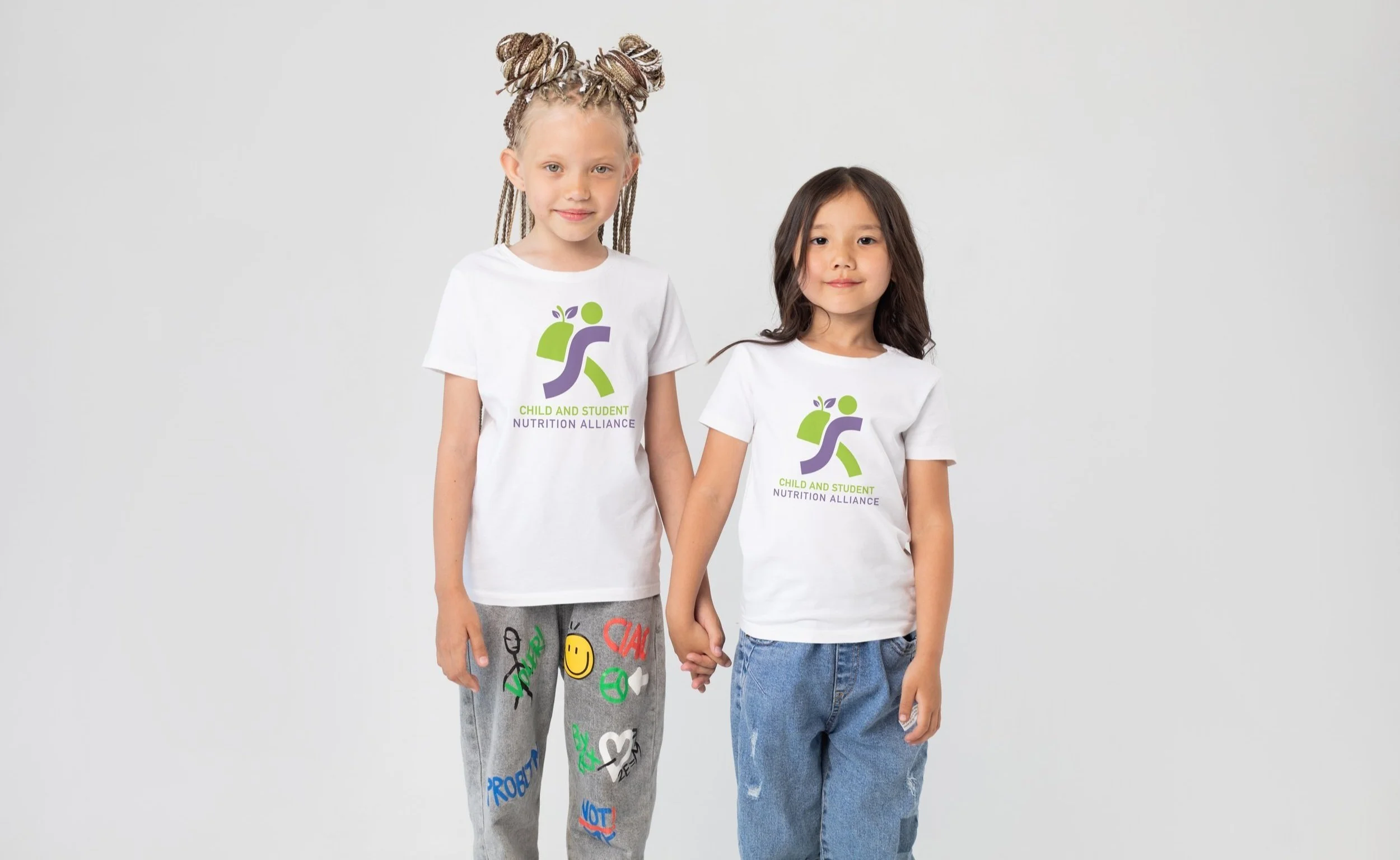
The logo where it belongs.
How I Work With Founders and Boards
Logo projects usually start with very little: a mission, a name, sometimes a single word of direction. That is not a problem; it is the job. We turn that starting point into developed concepts, not sketches, and we design for the realities nonprofits and small businesses live with: one- and two-color versions that keep printing affordable, black-and-white secondaries for single-color use, and a full family of files ready for everything from letterhead to social media and lapel pins. Behind every logo is twenty years of print production, so it will reproduce beautifully everywhere it lands.
Building a brand?
Thirty minutes, no obligations. We'll talk about your mission, your audience, and what a mark has to do for you.
< Previous case study Next case study >