
CASE STUDY / EDITORIAL DESIGN
Editorial That Sells Without Selling: An Advertorial for Sun Valley Luxury
LUXURY HOME + DESIGN MAGAZINE • ADVERTORIA • EDITORIALDCD Home Magazine, publisher of luxury-home titles across the Western US, needed an advertorial for an architecture firm. Advertorials carry a perennial trap: read too editorial and the brand disappears, read too promotional and the audience turns the page. The spread had to feel like a story while quietly positioning the firm as modern luxury.
THE PROBLEM
My photography background shaped the approach. I paired the two images in a deliberate conversation: one warm daytime, one alluring nighttime, the white furniture in the night shot echoing the white chair in the day shot so the eye travels the spread without a seam. On the opening page, the sky's negative space carries the headline and copy and draws the reader toward the facing page. A contemporary typeface matches the firm's aesthetic without announcing itself.
THE APPROACH
A spread that reads as editorial and works as positioning, presenting the firm as a purveyor of modern luxury to exactly the audience it wanted.
THE OUTCOME
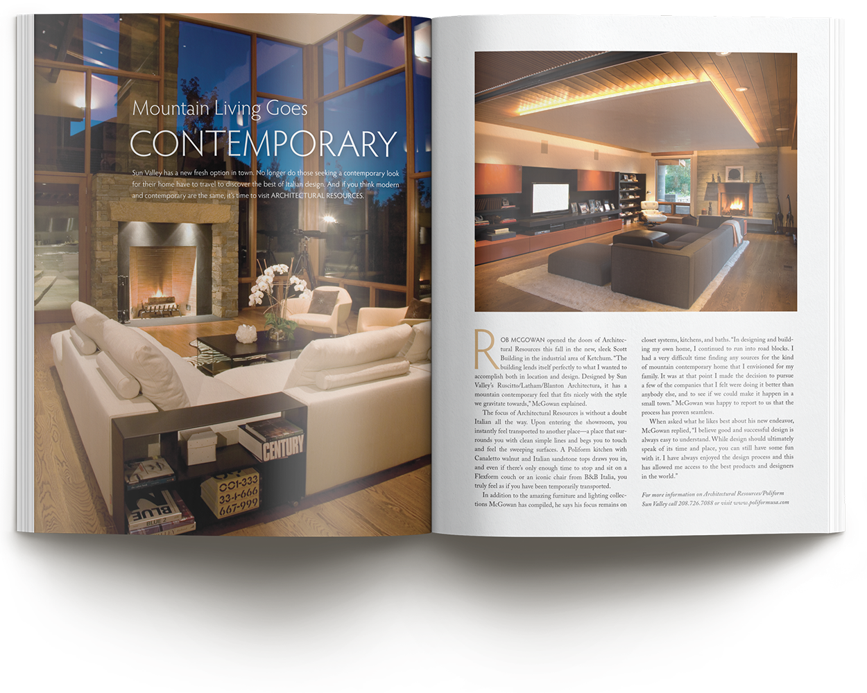
The spread. Day and night in conversation: white furniture echoing across both images so the eye travels the spread without a seam
2 Images
DAYTIME WARMTH AND NIGHTTIME ALLURE, CHOSEN TO ECHO EACH OTHER
1 Spread
EDITORIAL APPEAL CARRYING UNDERSTATED BRAND MESSAGING
Photo-First
CURATED WITH A PHOTOGRAPHER'S EYE BEFORE A DESIGNER'S GRID
Negative Space
THE EMPTY SKY IN ONE IMAGE BECAME THE HOME FOR THE TEXT
Scope also included: cover design, interior layout, concept development, creative direction, and photo editing.
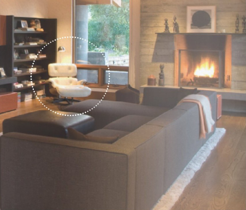
The daytime page. Warmth, clean lines, and negative space that carries the copy toward the facing page.
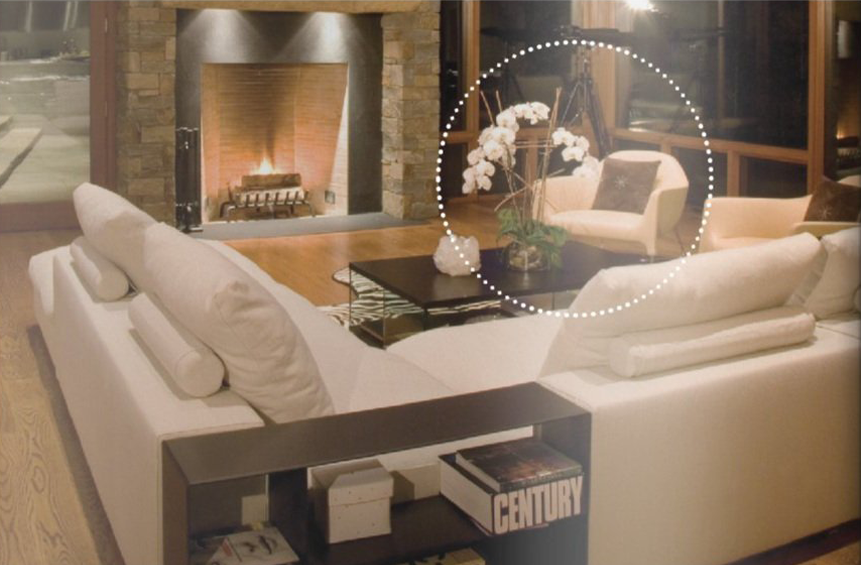
The nighttime page. Ambiance that lets the reader picture the evening, with furniture echoing the daytime shot for cohesion.
Process note: Advertorials live or die on restraint. Every choice here, the image pairing, the negative space, the typeface, was made to keep the brand present but unspoken, because this audience buys what it discovers, not what it is sold.
How I Work With Editors And Publications
Print publications run on hard dates, and I design accordingly. Give me the headline, the manuscript length, and whatever art you have, and I will bring back a cover and layout concept that serves the story, not just the page. Missing art is no obstacle; my background means I can shoot, illustrate, or source what the story needs. Two decades of editorial design, an eye trained first in photography, and thousands of pieces sent to press mean I can carry a concept from cover to folio under deadline pressure without cutting corners on craft. When the issue closes, it closes with the design intact.
Planning editorial pages?
Thirty minutes, no obligations. We'll talk about your publication, your deadline, and what the story needs from its design.
< Previous case study Next case study >